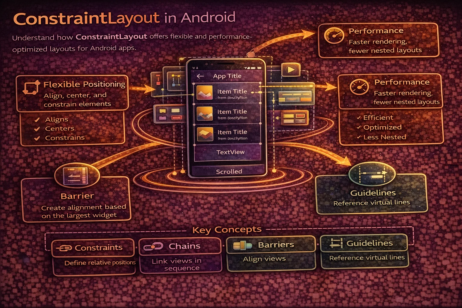
ConstraintLayout is the most powerful and recommended layout in Android. It lets you build complex, responsive UIs with a flat hierarchy — no nesting required. Before ConstraintLayout, building a profile card with an avatar, name, subtitle, and action buttons required nested LinearLayouts or RelativeLayout hacks. With ConstraintLayout, everything sits at the same level, connected by constraints. This guide covers every feature you’ll use in production — basic constraints, chains, guidelines, barriers, flow, ratio, and responsive design patterns.
Why ConstraintLayout?
// The performance problem with nested layouts:
//
// ❌ Nested LinearLayouts — multiple measure passes
// <LinearLayout vertical>              ← 1st measure pass
//   <LinearLayout horizontal>          ← 2nd measure pass (nested)
//     <ImageView />
//     <LinearLayout vertical>          ← 3rd measure pass (nested again!)
//       <TextView />
//       <TextView />
//     </LinearLayout>
//   </LinearLayout>
//   <LinearLayout horizontal>          ← 4th measure pass
//     <Button />
//     <Button />
//   </LinearLayout>
// </LinearLayout>
// 4 levels deep → exponential measure passes → slow rendering

// ✅ ConstraintLayout — flat hierarchy, single measure pass
// <ConstraintLayout>                   ← 1 measure pass for everything
//   <ImageView />
//   <TextView />
//   <TextView />
//   <Button />
//   <Button />
// </ConstraintLayout>
// 1 level deep → O(n) measure → fast rendering

// ConstraintLayout advantages:
// - Flat hierarchy → faster measure/layout/draw
// - Handles complex layouts without nesting
// - Responsive — constraints adapt to different screen sizes
// - Chains, guidelines, barriers for advanced positioning
// - Built-in percentage sizing and aspect ratio
Basic Constraints
Every View in ConstraintLayout needs at least one horizontal and one vertical constraint. A constraint connects one side of a View to another View or to the parent:
<!-- Constraint syntax:
     app:layout_constraintSTART_toSTARTOf="@id/other"
     app:layout_constraintSTART_toENDOf="@id/other"
     app:layout_constraintTOP_toTOPOf="parent"
     app:layout_constraintBOTTOM_toBOTTOMOf="@id/other"

     Start/End = horizontal (left/right in LTR)
     Top/Bottom = vertical -->

<!-- View anchored to top-start of parent -->
<TextView
    android:id="@+id/title"
    android:layout_width="wrap_content"
    android:layout_height="wrap_content"
    app:layout_constraintStart_toStartOf="parent"
    app:layout_constraintTop_toTopOf="parent" />

<!-- View positioned to the right of another View -->
<TextView
    android:id="@+id/subtitle"
    android:layout_width="wrap_content"
    android:layout_height="wrap_content"
    app:layout_constraintStart_toEndOf="@id/title"
    app:layout_constraintTop_toTopOf="@id/title"
    android:layout_marginStart="8dp" />

<!-- View below another View, stretching full width -->
<TextView
    android:id="@+id/description"
    android:layout_width="0dp"
    android:layout_height="wrap_content"
    app:layout_constraintStart_toStartOf="parent"
    app:layout_constraintEnd_toEndOf="parent"
    app:layout_constraintTop_toBottomOf="@id/title"
    android:layout_marginTop="8dp" />

<!-- ⚠️ Missing constraints:
     No horizontal constraint → View jumps to position 0,0
     No vertical constraint → View jumps to position 0,0
     Always set at least one Start/End AND one Top/Bottom -->
0dp — Match Constraints
<!-- 0dp means "my size is determined by my constraints"
     NOT the same as match_parent -->

<!-- Full width — start and end constrained to parent -->
<TextView
    android:layout_width="0dp"
    android:layout_height="wrap_content"
    app:layout_constraintStart_toStartOf="parent"
    app:layout_constraintEnd_toEndOf="parent" />
<!-- Width = parent width minus margins -->

<!-- Fill space between two Views -->
<TextView
    android:layout_width="0dp"
    android:layout_height="wrap_content"
    app:layout_constraintStart_toEndOf="@id/avatar"
    app:layout_constraintEnd_toStartOf="@id/button"
    android:layout_marginHorizontal="8dp" />
<!-- Width = space between avatar and button minus margins -->

<!-- ❌ Don't use match_parent in ConstraintLayout -->
android:layout_width="match_parent"   <!-- wrong -->

<!-- ✅ Use 0dp with constraints -->
android:layout_width="0dp"            <!-- correct -->
Centering and Bias
<!-- Center horizontally — constrain both sides to parent -->
<TextView
    android:layout_width="wrap_content"
    android:layout_height="wrap_content"
    app:layout_constraintStart_toStartOf="parent"
    app:layout_constraintEnd_toEndOf="parent" />
<!-- The View is centered because both sides pull equally -->

<!-- Center vertically -->
<TextView
    android:layout_width="wrap_content"
    android:layout_height="wrap_content"
    app:layout_constraintTop_toTopOf="parent"
    app:layout_constraintBottom_toBottomOf="parent" />

<!-- Center both axes (dead center of parent) -->
<ProgressBar
    android:layout_width="wrap_content"
    android:layout_height="wrap_content"
    app:layout_constraintStart_toStartOf="parent"
    app:layout_constraintEnd_toEndOf="parent"
    app:layout_constraintTop_toTopOf="parent"
    app:layout_constraintBottom_toBottomOf="parent" />
Bias — off-center positioning
<!-- Bias shifts the View along its constrained axis
     0.0 = all the way to start/top
     0.5 = centered (default)
     1.0 = all the way to end/bottom -->

<!-- 30% from the left -->
<TextView
    android:layout_width="wrap_content"
    android:layout_height="wrap_content"
    app:layout_constraintStart_toStartOf="parent"
    app:layout_constraintEnd_toEndOf="parent"
    app:layout_constraintHorizontal_bias="0.3" />

<!-- 20% from the top -->
<ImageView
    android:layout_width="wrap_content"
    android:layout_height="wrap_content"
    app:layout_constraintTop_toTopOf="parent"
    app:layout_constraintBottom_toBottomOf="parent"
    app:layout_constraintVertical_bias="0.2" />

<!-- Bias is great for responsive positioning that scales with screen size
     A View at bias 0.3 stays at 30% regardless of screen width -->
Chains
A chain is a group of Views that are linked together and distributed along an axis. They’re the ConstraintLayout replacement for LinearLayout’s weight distribution:
<!-- Horizontal chain: A ↔ B ↔ C
     Created by linking Views to each other bidirectionally -->

<Button
    android:id="@+id/btnA"
    android:layout_width="wrap_content"
    android:layout_height="wrap_content"
    app:layout_constraintStart_toStartOf="parent"
    app:layout_constraintEnd_toStartOf="@id/btnB"
    app:layout_constraintHorizontal_chainStyle="spread" />

<Button
    android:id="@+id/btnB"
    android:layout_width="wrap_content"
    android:layout_height="wrap_content"
    app:layout_constraintStart_toEndOf="@id/btnA"
    app:layout_constraintEnd_toStartOf="@id/btnC" />

<Button
    android:id="@+id/btnC"
    android:layout_width="wrap_content"
    android:layout_height="wrap_content"
    app:layout_constraintStart_toEndOf="@id/btnB"
    app:layout_constraintEnd_toEndOf="parent" />
Chain styles
<!-- Chain style is set on the FIRST element in the chain -->

<!-- SPREAD (default) — evenly distributed with space between
     |  A  |  B  |  C  |
     Equal spacing around each item -->
app:layout_constraintHorizontal_chainStyle="spread"

<!-- SPREAD_INSIDE — items at edges, space between
     |A    B    C|
     First and last touch the edges -->
app:layout_constraintHorizontal_chainStyle="spread_inside"

<!-- PACKED — items grouped together in the center
     |   ABC   |
     All items packed together, centered by default -->
app:layout_constraintHorizontal_chainStyle="packed"
<!-- Use bias to shift the packed group off-center -->
app:layout_constraintHorizontal_bias="0.0"   <!-- packed to start -->

<!-- WEIGHTED — like LinearLayout weight
     Set width to 0dp and use layout_constraintHorizontal_weight -->
<Button
    android:layout_width="0dp"
    app:layout_constraintHorizontal_weight="1" />
<Button
    android:layout_width="0dp"
    app:layout_constraintHorizontal_weight="2" />
<!-- Second button gets 2x the space of the first -->
Guidelines
A Guideline is an invisible line that you can constrain Views to. It doesn’t render on screen — it’s purely for positioning:
<!-- Vertical guideline at 30% from start -->
<androidx.constraintlayout.widget.Guideline
    android:id="@+id/guidelineVertical"
    android:layout_width="wrap_content"
    android:layout_height="wrap_content"
    android:orientation="vertical"
    app:layout_constraintGuide_percent="0.3" />

<!-- Horizontal guideline at 64dp from top -->
<androidx.constraintlayout.widget.Guideline
    android:id="@+id/guidelineTop"
    android:layout_width="wrap_content"
    android:layout_height="wrap_content"
    android:orientation="horizontal"
    app:layout_constraintGuide_begin="64dp" />

<!-- Constrain Views to the guideline -->
<TextView
    android:layout_width="0dp"
    android:layout_height="wrap_content"
    app:layout_constraintStart_toStartOf="@id/guidelineVertical"
    app:layout_constraintEnd_toEndOf="parent"
    app:layout_constraintTop_toBottomOf="@id/guidelineTop" />

<!-- Guideline positioning options:
     layout_constraintGuide_begin="64dp"    — fixed distance from start/top
     layout_constraintGuide_end="32dp"      — fixed distance from end/bottom
     layout_constraintGuide_percent="0.3"   — percentage of parent (responsive) -->

<!-- Use cases:
     - Form labels aligned at 30% width
     - Content area starting below a fixed header height
     - Responsive breakpoints that adapt to screen size -->
Barriers
A Barrier is an invisible wall that positions itself based on the most extreme edge of a group of Views. Unlike a Guideline which has a fixed position, a Barrier moves dynamically:
<!-- Problem: two labels of different lengths, content must start after the longer one

     Name:      |  Alice Johnson
     Email:     |  alice@example.com
     Phone number: |  +1 234 567 8900
                   ↑ barrier sits here (after longest label) -->

<TextView android:id="@+id/labelName" android:text="Name:" ... />
<TextView android:id="@+id/labelEmail" android:text="Email:" ... />
<TextView android:id="@+id/labelPhone" android:text="Phone number:" ... />

<!-- Barrier positions itself after the widest label -->
<androidx.constraintlayout.widget.Barrier
    android:id="@+id/labelBarrier"
    android:layout_width="wrap_content"
    android:layout_height="wrap_content"
    app:barrierDirection="end"
    app:constraint_referenced_ids="labelName,labelEmail,labelPhone" />

<!-- Values constrained to the barrier — always start after the longest label -->
<TextView
    android:id="@+id/valueName"
    app:layout_constraintStart_toEndOf="@id/labelBarrier"
    app:layout_constraintTop_toTopOf="@id/labelName"
    android:layout_marginStart="8dp"
    android:text="Alice Johnson" />

<!-- barrierDirection options:
     start, end, top, bottom
     The barrier sits at the most extreme edge in that direction -->

<!-- Barrier vs Guideline:
     Guideline: fixed position (30%, 64dp)
     Barrier: dynamic position (moves based on referenced Views' sizes) -->
Aspect Ratio
<!-- Maintain a fixed aspect ratio regardless of screen size -->

<!-- 16:9 image — width fills parent, height adjusts to maintain ratio -->
<ImageView
    android:layout_width="0dp"
    android:layout_height="0dp"
    app:layout_constraintStart_toStartOf="parent"
    app:layout_constraintEnd_toEndOf="parent"
    app:layout_constraintTop_toTopOf="parent"
    app:layout_constraintDimensionRatio="16:9"
    android:scaleType="centerCrop" />
<!-- One dimension must be 0dp (match constraints)
     The ratio determines the other dimension -->

<!-- Square avatar -->
<ImageView
    android:layout_width="0dp"
    android:layout_height="0dp"
    app:layout_constraintDimensionRatio="1:1"
    app:layout_constraintStart_toStartOf="parent"
    app:layout_constraintEnd_toEndOf="parent"
    app:layout_constraintWidth_percent="0.3" />
<!-- 30% of parent width, height = width (1:1 ratio) -->

<!-- Specify which dimension the ratio constrains:
     "H,16:9" — height is constrained by ratio (width drives)
     "W,16:9" — width is constrained by ratio (height drives) -->
app:layout_constraintDimensionRatio="H,16:9"
Percentage Sizing
<!-- Size a View as a percentage of parent -->

<!-- 50% of parent width -->
<Button
    android:layout_width="0dp"
    android:layout_height="wrap_content"
    app:layout_constraintStart_toStartOf="parent"
    app:layout_constraintEnd_toEndOf="parent"
    app:layout_constraintWidth_percent="0.5" />

<!-- 30% of parent height -->
<View
    android:layout_width="match_parent"
    android:layout_height="0dp"
    app:layout_constraintTop_toTopOf="parent"
    app:layout_constraintBottom_toBottomOf="parent"
    app:layout_constraintHeight_percent="0.3" />

<!-- layout_constraintWidth_percent requires width to be 0dp
     layout_constraintHeight_percent requires height to be 0dp -->
ConstraintLayout Flow
Flow is a virtual layout helper that automatically wraps children into multiple rows or columns — like FlexBox:
<!-- Flow wraps tags/chips into rows automatically -->
<androidx.constraintlayout.helper.widget.Flow
    android:id="@+id/tagFlow"
    android:layout_width="0dp"
    android:layout_height="wrap_content"
    app:layout_constraintStart_toStartOf="parent"
    app:layout_constraintEnd_toEndOf="parent"
    app:layout_constraintTop_toTopOf="parent"
    app:flow_wrapMode="chain"
    app:flow_horizontalGap="8dp"
    app:flow_verticalGap="8dp"
    app:flow_horizontalStyle="packed"
    app:flow_horizontalBias="0"
    app:constraint_referenced_ids="tag1,tag2,tag3,tag4,tag5,tag6" />

<com.google.android.material.chip.Chip
    android:id="@+id/tag1"
    android:layout_width="wrap_content"
    android:layout_height="wrap_content"
    android:text="Kotlin" />

<com.google.android.material.chip.Chip
    android:id="@+id/tag2"
    android:layout_width="wrap_content"
    android:layout_height="wrap_content"
    android:text="Android" />

<!-- ... more tags ... -->

<!-- flow_wrapMode options:
     none    — single line, items overflow (like a chain)
     chain   — wraps to next line when out of space
     aligned — wraps and aligns in a grid -->
Group — Control Visibility Together
<!-- Group lets you control visibility of multiple Views at once -->

<TextView android:id="@+id/errorIcon" ... />
<TextView android:id="@+id/errorMessage" ... />
<Button android:id="@+id/retryButton" ... />

<androidx.constraintlayout.widget.Group
    android:id="@+id/errorGroup"
    android:layout_width="wrap_content"
    android:layout_height="wrap_content"
    android:visibility="gone"
    app:constraint_referenced_ids="errorIcon,errorMessage,retryButton" />

<!-- Toggle all three Views at once -->
// In code — one line controls all three Views
binding.errorGroup.isVisible = true // shows errorIcon + errorMessage + retryButton
binding.errorGroup.isVisible = false // hides all three
// Much cleaner than:
// binding.errorIcon.isVisible = true
// binding.errorMessage.isVisible = true
// binding.retryButton.isVisible = trueReal-World Layout Example
<!-- Article card — flat hierarchy, no nesting -->
<androidx.constraintlayout.widget.ConstraintLayout
    android:layout_width="match_parent"
    android:layout_height="wrap_content"
    android:padding="16dp">

    <!-- 16:9 cover image -->
    <ImageView
        android:id="@+id/coverImage"
        android:layout_width="0dp"
        android:layout_height="0dp"
        app:layout_constraintDimensionRatio="16:9"
        app:layout_constraintStart_toStartOf="parent"
        app:layout_constraintEnd_toEndOf="parent"
        app:layout_constraintTop_toTopOf="parent"
        android:scaleType="centerCrop" />

    <!-- Author avatar -->
    <ImageView
        android:id="@+id/avatar"
        android:layout_width="32dp"
        android:layout_height="32dp"
        app:layout_constraintStart_toStartOf="parent"
        app:layout_constraintTop_toBottomOf="@id/coverImage"
        android:layout_marginTop="12dp" />

    <!-- Author name — to the right of avatar -->
    <TextView
        android:id="@+id/authorName"
        android:layout_width="0dp"
        android:layout_height="wrap_content"
        app:layout_constraintStart_toEndOf="@id/avatar"
        app:layout_constraintEnd_toStartOf="@id/bookmarkBtn"
        app:layout_constraintTop_toTopOf="@id/avatar"
        android:layout_marginStart="8dp" />

    <!-- Date — below author name, aligned with it -->
    <TextView
        android:id="@+id/date"
        android:layout_width="0dp"
        android:layout_height="wrap_content"
        app:layout_constraintStart_toStartOf="@id/authorName"
        app:layout_constraintEnd_toEndOf="@id/authorName"
        app:layout_constraintTop_toBottomOf="@id/authorName" />

    <!-- Bookmark button — end-aligned -->
    <ImageButton
        android:id="@+id/bookmarkBtn"
        android:layout_width="40dp"
        android:layout_height="40dp"
        app:layout_constraintEnd_toEndOf="parent"
        app:layout_constraintTop_toTopOf="@id/avatar"
        app:layout_constraintBottom_toBottomOf="@id/date" />

    <!-- Title — full width below metadata -->
    <TextView
        android:id="@+id/title"
        android:layout_width="0dp"
        android:layout_height="wrap_content"
        app:layout_constraintStart_toStartOf="parent"
        app:layout_constraintEnd_toEndOf="parent"
        app:layout_constraintTop_toBottomOf="@id/date"
        android:layout_marginTop="8dp"
        android:textSize="18sp"
        android:maxLines="2"
        android:ellipsize="end" />

    <!-- Tag chips — wrapped with Flow -->
    <androidx.constraintlayout.helper.widget.Flow
        android:id="@+id/tagFlow"
        android:layout_width="0dp"
        android:layout_height="wrap_content"
        app:layout_constraintStart_toStartOf="parent"
        app:layout_constraintEnd_toEndOf="parent"
        app:layout_constraintTop_toBottomOf="@id/title"
        android:layout_marginTop="8dp"
        app:flow_wrapMode="chain"
        app:flow_horizontalGap="8dp"
        app:constraint_referenced_ids="tag1,tag2,tag3" />

    <com.google.android.material.chip.Chip
        android:id="@+id/tag1" android:layout_width="wrap_content"
        android:layout_height="wrap_content" />
    <com.google.android.material.chip.Chip
        android:id="@+id/tag2" android:layout_width="wrap_content"
        android:layout_height="wrap_content" />
    <com.google.android.material.chip.Chip
        android:id="@+id/tag3" android:layout_width="wrap_content"
        android:layout_height="wrap_content" />

</androidx.constraintlayout.widget.ConstraintLayout>

<!-- This entire card is FLAT — no nesting, one measure pass
     Equivalent nested layout would need 3-4 levels of LinearLayout -->
Common Mistakes to Avoid
Mistake 1: Missing constraints
<!-- ❌ No vertical constraint — View jumps to top-left (0,0) -->
<TextView
    android:layout_width="wrap_content"
    android:layout_height="wrap_content"
    app:layout_constraintStart_toStartOf="parent" />
<!-- Has horizontal constraint but no vertical! -->

<!-- ✅ Always set both axes -->
<TextView
    android:layout_width="wrap_content"
    android:layout_height="wrap_content"
    app:layout_constraintStart_toStartOf="parent"
    app:layout_constraintTop_toTopOf="parent" />
Mistake 2: Using match_parent instead of 0dp
<!-- ❌ match_parent ignores constraints and margins -->
<TextView
    android:layout_width="match_parent"
    app:layout_constraintStart_toStartOf="parent"
    app:layout_constraintEnd_toEndOf="parent"
    android:layout_marginHorizontal="16dp" />
<!-- Margins are IGNORED — View fills full parent width -->

<!-- ✅ 0dp respects constraints and margins -->
<TextView
    android:layout_width="0dp"
    app:layout_constraintStart_toStartOf="parent"
    app:layout_constraintEnd_toEndOf="parent"
    android:layout_marginHorizontal="16dp" />
<!-- Width = parent width - 32dp margins -->
Mistake 3: Circular dependencies
<!-- ❌ A depends on B, B depends on A — undefined behaviour -->
<TextView android:id="@+id/a"
    app:layout_constraintStart_toEndOf="@id/b" />
<TextView android:id="@+id/b"
    app:layout_constraintStart_toEndOf="@id/a" />

<!-- ✅ Use chains for bidirectional relationships -->
<TextView android:id="@+id/a"
    app:layout_constraintStart_toStartOf="parent"
    app:layout_constraintEnd_toStartOf="@id/b" />
<TextView android:id="@+id/b"
    app:layout_constraintStart_toEndOf="@id/a"
    app:layout_constraintEnd_toEndOf="parent" />
Mistake 4: Using guidelines when barriers are needed
<!-- ❌ Fixed guideline — doesn't adapt if label text gets longer -->
<Guideline app:layout_constraintGuide_begin="100dp" />
<!-- What if "Phone number:" is longer than 100dp? Content overlaps! -->

<!-- ✅ Barrier adapts to content -->
<Barrier
    app:barrierDirection="end"
    app:constraint_referenced_ids="labelName,labelEmail,labelPhone" />
<!-- Barrier moves right if any label gets longer -->
Mistake 5: Not using Group for visibility management
// ❌ Manually toggling each View — verbose and error-prone
binding.errorIcon.isVisible = showError
binding.errorMessage.isVisible = showError
binding.retryButton.isVisible = showError
// Easy to forget one!

// ✅ Use Group — one line controls all
binding.errorGroup.isVisible = showError
Summary
- ConstraintLayout is the recommended default layout — flat hierarchy, single measure pass, best performance
- Every View needs at least one horizontal and one vertical constraint
- Use
0dp(match constraints) instead ofmatch_parent— respects constraints and margins - Centering: constrain both sides to parent; use bias for off-center positioning (0.0–1.0)
- Chains distribute Views along an axis — spread, spread_inside, packed, or weighted
- Guidelines are invisible lines at fixed positions (dp or %) for aligning Views
- Barriers are dynamic invisible walls that adapt to the most extreme edge of referenced Views
- Aspect ratio (
layout_constraintDimensionRatio) maintains proportions — perfect for images (16:9, 1:1) - Percentage sizing (
layout_constraintWidth_percent) sizes Views as a fraction of parent - Flow automatically wraps children into rows/columns — like FlexBox for tags and chips
- Group controls visibility of multiple Views with one line
- Avoid match_parent, missing constraints, and circular dependencies
- Use barriers over guidelines when content size varies dynamically
ConstraintLayout replaces most use cases for LinearLayout, FrameLayout, and RelativeLayout — in a single, flat, performant layout. Master constraints, chains, barriers, and Flow, and you can build any layout Android designers throw at you without a single nested ViewGroup.
Happy coding!
Comments (0)