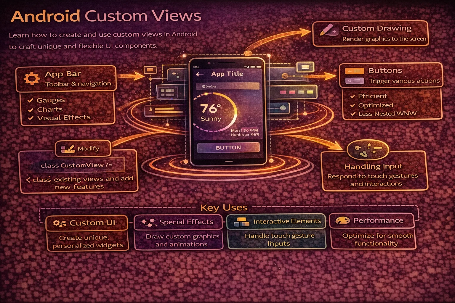
At some point, the built-in Views won’t be enough. You’ll need a circular progress indicator with custom text inside, a rating bar with a unique design, a waveform visualiser, or a chart that doesn’t exist in any library. That’s when you build a Custom View. Custom Views let you draw anything on the Canvas, handle touch gestures, define custom XML attributes, and create reusable components that work just like any other View. This guide covers everything from basic custom drawing to compound Views, custom attributes, saving state, and accessibility.
Three Approaches to Custom Views
// 1. EXTEND an existing View — modify behaviour of Button, TextView, ImageView, etc.
//    Use when: you want slight modifications to an existing widget
//    Example: auto-resizing text, circular ImageView

// 2. COMPOUND View — combine existing Views into a reusable component
//    Use when: you have a group of Views used together repeatedly
//    Example: labeled input field, user avatar with badge, search bar

// 3. FULLY CUSTOM View — draw from scratch on Canvas
//    Use when: nothing existing matches, you need full control
//    Example: chart, gauge, waveform, circular progress with text
Approach 1: Extending an Existing View
// Example: CircularImageView — clips an ImageView to a circle

class CircularImageView @JvmOverloads constructor(
    context: Context,
    attrs: AttributeSet? = null,
    defStyleAttr: Int = 0
) : AppCompatImageView(context, attrs, defStyleAttr) {

    private val clipPath = Path()

    override fun onDraw(canvas: Canvas) {
        // Clip canvas to a circle before drawing the image
        val radius = (width.coerceAtMost(height) / 2).toFloat()
        clipPath.reset()
        clipPath.addCircle(width / 2f, height / 2f, radius, Path.Direction.CW)
        canvas.clipPath(clipPath)

        super.onDraw(canvas)   // let ImageView draw the image (now clipped)
    }
}

// Usage in XML — works just like a regular ImageView
// <com.example.views.CircularImageView
//     android:layout_width="48dp"
//     android:layout_height="48dp"
//     android:src="@drawable/avatar"
//     android:scaleType="centerCrop" />
The @JvmOverloads constructor pattern
// Every custom View needs multiple constructors for Android to inflate it correctly
// @JvmOverloads generates them automatically from default parameter values

class MyView @JvmOverloads constructor(
    context: Context,                  // used when creating in code: MyView(context)
    attrs: AttributeSet? = null,       // used when inflating from XML
    defStyleAttr: Int = 0              // used when applying a default style
) : View(context, attrs, defStyleAttr)

// Without @JvmOverloads, you'd need three separate constructors:
// constructor(context: Context) : super(context)
// constructor(context: Context, attrs: AttributeSet?) : super(context, attrs)
// constructor(context: Context, attrs: AttributeSet?, defStyleAttr: Int) : super(...)
Approach 2: Compound View
// Combine multiple Views into one reusable component
// Example: LabeledInputView — label + text input + error text

// res/layout/view_labeled_input.xml
// <merge xmlns:android="http://schemas.android.com/apk/res/android">
//     <TextView android:id="@+id/label" ... />
//     <com.google.android.material.textfield.TextInputLayout android:id="@+id/inputLayout">
//         <com.google.android.material.textfield.TextInputEditText android:id="@+id/input" />
//     </com.google.android.material.textfield.TextInputLayout>
//     <TextView android:id="@+id/errorText" android:visibility="gone" />
// </merge>

class LabeledInputView @JvmOverloads constructor(
    context: Context,
    attrs: AttributeSet? = null,
    defStyleAttr: Int = 0
) : LinearLayout(context, attrs, defStyleAttr) {

    private val binding: ViewLabeledInputBinding

    init {
        orientation = VERTICAL

        // Inflate using merge — attaches children directly to this ViewGroup
        binding = ViewLabeledInputBinding.inflate(
            LayoutInflater.from(context), this, true
        )

        // Read custom attributes
        context.theme.obtainStyledAttributes(attrs, R.styleable.LabeledInputView, 0, 0).apply {
            try {
                binding.label.text = getString(R.styleable.LabeledInputView_labelText) ?: ""
                binding.input.hint = getString(R.styleable.LabeledInputView_hintText) ?: ""
                val inputType = getInt(R.styleable.LabeledInputView_android_inputType,
                    InputType.TYPE_CLASS_TEXT)
                binding.input.inputType = inputType
            } finally {
                recycle()   // always recycle TypedArray!
            }
        }
    }

    var text: String
        get() = binding.input.text.toString()
        set(value) { binding.input.setText(value) }

    var error: String?
        get() = binding.errorText.text.toString()
        set(value) {
            binding.errorText.text = value
            binding.errorText.isVisible = value != null
        }

    fun addTextChangedListener(watcher: TextWatcher) {
        binding.input.addTextChangedListener(watcher)
    }
}

// Usage in XML:
// <com.example.views.LabeledInputView
//     android:layout_width="match_parent"
//     android:layout_height="wrap_content"
//     app:labelText="Email"
//     app:hintText="Enter your email"
//     android:inputType="textEmailAddress" />

// Usage in code:
// binding.emailInput.text = "alice@example.com"
// binding.emailInput.error = "Invalid email"
Why use <merge>?
// Without merge — unnecessary extra ViewGroup
// LabeledInputView (LinearLayout)
//   └── LinearLayout (from inflation)  ← redundant wrapper!
//         ├── TextView
//         └── TextInputLayout

// With merge — children attach directly
// LabeledInputView (LinearLayout)
//   ├── TextView
//   └── TextInputLayout

// Rule: use <merge> when inflating into a ViewGroup that IS the custom View
// It prevents adding an unnecessary extra level of nesting
Approach 3: Fully Custom View — Drawing on Canvas
Example: Circular Progress View with percentage text
class CircularProgressView @JvmOverloads constructor(
    context: Context,
    attrs: AttributeSet? = null,
    defStyleAttr: Int = 0
) : View(context, attrs, defStyleAttr) {

    // Paint objects — create ONCE (never in onDraw)
    private val backgroundPaint = Paint(Paint.ANTI_ALIAS_FLAG).apply {
        color = Color.LTGRAY
        style = Paint.Style.STROKE
        strokeWidth = 12f.dp
        strokeCap = Paint.Cap.ROUND
    }

    private val progressPaint = Paint(Paint.ANTI_ALIAS_FLAG).apply {
        color = context.getColorCompat(R.color.primary)
        style = Paint.Style.STROKE
        strokeWidth = 12f.dp
        strokeCap = Paint.Cap.ROUND
    }

    private val textPaint = Paint(Paint.ANTI_ALIAS_FLAG).apply {
        color = context.getColorCompat(R.color.on_surface)
        textSize = 24f.sp
        textAlign = Paint.Align.CENTER
        typeface = Typeface.create("sans-serif-medium", Typeface.NORMAL)
    }

    private val arcRect = RectF()

    // Progress value (0–100)
    var progress: Int = 0
        set(value) {
            field = value.coerceIn(0, 100)
            invalidate()   // trigger redraw when progress changes
        }

    override fun onSizeChanged(w: Int, h: Int, oldW: Int, oldH: Int) {
        super.onSizeChanged(w, h, oldW, oldH)
        // Calculate the arc rectangle with padding for stroke width
        val padding = backgroundPaint.strokeWidth / 2
        arcRect.set(padding, padding, w - padding, h - padding)
    }

    override fun onDraw(canvas: Canvas) {
        super.onDraw(canvas)

        // 1. Draw background circle
        canvas.drawArc(arcRect, 0f, 360f, false, backgroundPaint)

        // 2. Draw progress arc
        val sweepAngle = (progress / 100f) * 360f
        canvas.drawArc(arcRect, -90f, sweepAngle, false, progressPaint)

        // 3. Draw percentage text in the center
        val text = "$progress%"
        val textY = (height / 2f) - (textPaint.descent() + textPaint.ascent()) / 2
        canvas.drawText(text, width / 2f, textY, textPaint)
    }

    override fun onMeasure(widthMeasureSpec: Int, heightMeasureSpec: Int) {
        // Default to 120dp if no size specified
        val defaultSize = 120.dp.toInt()
        val width = resolveSize(defaultSize, widthMeasureSpec)
        val height = resolveSize(defaultSize, heightMeasureSpec)
        // Force square — use the smaller dimension
        val size = width.coerceAtMost(height)
        setMeasuredDimension(size, size)
    }

    // Extension properties for dp/sp conversion
    private val Float.dp: Float get() = this * resources.displayMetrics.density
    private val Float.sp: Float get() = this * resources.displayMetrics.scaledDensity
    private val Int.dp: Float get() = this.toFloat().dp
}

// Usage in XML:
// <com.example.views.CircularProgressView
//     android:id="@+id/progressView"
//     android:layout_width="120dp"
//     android:layout_height="120dp" />

// Usage in code:
// binding.progressView.progress = 75
The Three Key Overrides
onMeasure() — how big should the View be?
// Called by the parent to ask: "how big do you want to be?"
// You must call setMeasuredDimension() with your desired width and height

override fun onMeasure(widthMeasureSpec: Int, heightMeasureSpec: Int) {
    // MeasureSpec contains two pieces of information:
    // 1. MODE — how the parent constrains you
    // 2. SIZE — the available size from the parent

    val widthMode = MeasureSpec.getMode(widthMeasureSpec)
    val widthSize = MeasureSpec.getSize(widthMeasureSpec)

    // Modes:
    // EXACTLY    — parent dictates exact size (match_parent or fixed dp)
    // AT_MOST    — parent sets a max, you can be smaller (wrap_content)
    // UNSPECIFIED — no constraint (ScrollView children)

    val desiredWidth = calculateDesiredWidth()

    val width = when (widthMode) {
        MeasureSpec.EXACTLY -> widthSize                              // use parent's size
        MeasureSpec.AT_MOST -> desiredWidth.coerceAtMost(widthSize)  // fit within parent
        else -> desiredWidth                                          // use desired
    }

    // resolveSize() does the above logic for you:
    val width = resolveSize(desiredWidth, widthMeasureSpec)
    val height = resolveSize(desiredHeight, heightMeasureSpec)

    setMeasuredDimension(width, height)   // MUST call this
}
onSizeChanged() — final size is known
// Called after measurement when the View's size has been determined
// This is where you calculate layout-dependent values

override fun onSizeChanged(w: Int, h: Int, oldW: Int, oldH: Int) {
    super.onSizeChanged(w, h, oldW, oldH)

    // Pre-calculate positions and rectangles
    centerX = w / 2f
    centerY = h / 2f
    radius = (w.coerceAtMost(h) / 2f) - strokeWidth

    // Update RectF for arcs
    arcRect.set(strokeWidth, strokeWidth, w - strokeWidth, h - strokeWidth)
}

// Avoid doing these calculations in onDraw — onDraw is called 60 times/second
// onSizeChanged is called only when the size actually changes
onDraw() — render on Canvas
// Called every frame to draw the View's content
// This is the performance-critical method — keep it FAST

override fun onDraw(canvas: Canvas) {
    super.onDraw(canvas)

    // Draw background
    canvas.drawCircle(centerX, centerY, radius, backgroundPaint)

    // Draw content
    canvas.drawArc(arcRect, startAngle, sweepAngle, false, progressPaint)

    // Draw text
    canvas.drawText(label, centerX, textY, textPaint)
}

// PERFORMANCE RULES for onDraw:
// ❌ Never allocate objects (Paint, Rect, Path) inside onDraw
// ❌ Never do calculations that don't change per frame
// ❌ Never log or do I/O
// ✅ Only draw using pre-calculated values and pre-created Paint objects
// ✅ Use invalidate() to trigger a redraw when data changes
Custom XML Attributes
// Step 1: Declare attributes in res/values/attrs.xml
<resources>
    <declare-styleable name="CircularProgressView">
        <attr name="progress" format="integer" />
        <attr name="progressColor" format="color" />
        <attr name="trackColor" format="color" />
        <attr name="strokeWidth" format="dimension" />
        <attr name="showPercentage" format="boolean" />
        <attr name="textSize" format="dimension" />
    </declare-styleable>

    <declare-styleable name="LabeledInputView">
        <attr name="labelText" format="string" />
        <attr name="hintText" format="string" />
        <attr name="android:inputType" />  <!-- reuse Android's attribute -->
    </declare-styleable>
</resources>
// Step 2: Read attributes in the View constructor
init {
context.theme.obtainStyledAttributes(attrs, R.styleable.CircularProgressView, 0, 0).apply {
try {
progress = getInt(R.styleable.CircularProgressView_progress, 0)
progressPaint.color = getColor(
R.styleable.CircularProgressView_progressColor,
context.getColorCompat(R.color.primary) // default
)
backgroundPaint.color = getColor(
R.styleable.CircularProgressView_trackColor,
Color.LTGRAY
)
val stroke = getDimension(
R.styleable.CircularProgressView_strokeWidth,
12f.dp
)
progressPaint.strokeWidth = stroke
backgroundPaint.strokeWidth = stroke
showPercentage = getBoolean(
R.styleable.CircularProgressView_showPercentage,
true
)
textPaint.textSize = getDimension(
R.styleable.CircularProgressView_textSize,
24f.sp
)
} finally {
recycle() // ALWAYS recycle TypedArray to avoid memory leaks
}
}
}<!-- Step 3: Use in XML with app: namespace -->
<com.example.views.CircularProgressView
android:id="@+id/progressView"
android:layout_width="120dp"
android:layout_height="120dp"
app:progress="75"
app:progressColor="@color/primary"
app:trackColor="@color/surface_variant"
app:strokeWidth="8dp"
app:showPercentage="true"
app:textSize="20sp" />Saving and Restoring State
// Custom Views must save their state across configuration changes
// Otherwise, progress resets to 0 on rotation!

class CircularProgressView ... : View(...) {

    override fun onSaveInstanceState(): Parcelable {
        val superState = super.onSaveInstanceState()
        return bundleOf(
            "superState" to superState,
            "progress" to progress
        )
    }

    override fun onRestoreInstanceState(state: Parcelable?) {
        if (state is Bundle) {
            progress = state.getInt("progress", 0)
            super.onRestoreInstanceState(
                if (Build.VERSION.SDK_INT >= Build.VERSION_CODES.TIRAMISU) {
                    state.getParcelable("superState", Parcelable::class.java)
                } else {
                    @Suppress("DEPRECATION")
                    state.getParcelable("superState")
                }
            )
        } else {
            super.onRestoreInstanceState(state)
        }
    }
}

// ⚠️ State saving only works if the View has an android:id
// Views without IDs don't participate in state save/restore
Touch Handling
// Handle touch events for interactive custom Views

class SliderView ... : View(...) {

    private var currentValue = 0f   // 0.0 to 1.0

    override fun onTouchEvent(event: MotionEvent): Boolean {
        when (event.action) {
            MotionEvent.ACTION_DOWN,
            MotionEvent.ACTION_MOVE -> {
                // Calculate value from touch position
                currentValue = (event.x / width).coerceIn(0f, 1f)
                invalidate()   // redraw with new value
                onValueChanged?.invoke(currentValue)
                return true    // we handled the event
            }
            MotionEvent.ACTION_UP -> {
                performClick()   // accessibility — triggers click for screen readers
                return true
            }
        }
        return super.onTouchEvent(event)
    }

    // Must override performClick for accessibility
    override fun performClick(): Boolean {
        super.performClick()
        return true
    }

    // Callback for value changes
    var onValueChanged: ((Float) -> Unit)? = null
}
Accessibility
// Custom Views must be accessible for users with screen readers (TalkBack)

class CircularProgressView ... : View(...) {

    init {
        // Tell the system this is important for accessibility
        importantForAccessibility = IMPORTANT_FOR_ACCESSIBILITY_YES
    }

    // Provide a description for screen readers
    override fun onInitializeAccessibilityNodeInfo(info: AccessibilityNodeInfo) {
        super.onInitializeAccessibilityNodeInfo(info)
        info.className = "android.widget.ProgressBar"   // announce as progress bar
        info.contentDescription = "$progress percent complete"

        // For range controls (slider, progress)
        info.rangeInfo = AccessibilityNodeInfo.RangeInfo.obtain(
            AccessibilityNodeInfo.RangeInfo.RANGE_TYPE_INT,
            0f,       // min
            100f,     // max
            progress.toFloat()
        )
    }

    // Update accessibility when value changes
    var progress: Int = 0
        set(value) {
            field = value.coerceIn(0, 100)
            contentDescription = "$value percent complete"
            invalidate()
        }
}

// Accessibility checklist for custom Views:
// ✅ Set contentDescription for meaningful information
// ✅ Override performClick() if handling touch events
// ✅ Use AccessibilityNodeInfo for complex controls
// ✅ Support TalkBack navigation (focusable = true)
// ✅ Update contentDescription when value changes
Animation
// Animate custom View properties smoothly

class CircularProgressView ... : View(...) {

    private var animatedProgress = 0f

    fun animateProgress(targetProgress: Int, durationMs: Long = 800) {
        val animator = ValueAnimator.ofFloat(animatedProgress, targetProgress.toFloat())
        animator.duration = durationMs
        animator.interpolator = DecelerateInterpolator()
        animator.addUpdateListener { animation ->
            animatedProgress = animation.animatedValue as Float
            invalidate()   // redraw each frame
        }
        animator.start()
    }

    override fun onDraw(canvas: Canvas) {
        super.onDraw(canvas)
        // Use animatedProgress instead of progress for smooth animation
        val sweepAngle = (animatedProgress / 100f) * 360f
        canvas.drawArc(arcRect, -90f, sweepAngle, false, progressPaint)

        val text = "${animatedProgress.toInt()}%"
        canvas.drawText(text, width / 2f, textY, textPaint)
    }
}

// Usage
binding.progressView.animateProgress(75)   // smooth animation to 75%
Common Mistakes to Avoid
Mistake 1: Allocating objects in onDraw
// ❌ Creates new Paint every frame — 60 times per second = GC pressure
override fun onDraw(canvas: Canvas) {
    val paint = Paint().apply { color = Color.RED }   // new object every frame!
    canvas.drawCircle(x, y, r, paint)
}

// ✅ Create Paint once as a class property
private val paint = Paint(Paint.ANTI_ALIAS_FLAG).apply { color = Color.RED }

override fun onDraw(canvas: Canvas) {
    canvas.drawCircle(x, y, r, paint)   // reuses existing Paint
}
Mistake 2: Forgetting to call invalidate() when data changes
// ❌ Progress changes but View doesn't redraw
var progress: Int = 0
// Setting progress = 75 does nothing visually!

// ✅ Call invalidate() to trigger redraw
var progress: Int = 0
    set(value) {
        field = value
        invalidate()   // triggers onDraw with new value
    }
Mistake 3: Not calling recycle() on TypedArray
// ❌ Memory leak — TypedArray holds references
val a = context.obtainStyledAttributes(attrs, R.styleable.MyView)
val color = a.getColor(R.styleable.MyView_myColor, Color.BLACK)
// forgot a.recycle()!

// ✅ Always recycle in a try-finally block
val a = context.obtainStyledAttributes(attrs, R.styleable.MyView)
try {
    val color = a.getColor(R.styleable.MyView_myColor, Color.BLACK)
} finally {
    a.recycle()
}
Mistake 4: Not overriding performClick for touch handling
// ❌ Accessibility warning — screen readers can't trigger the click
override fun onTouchEvent(event: MotionEvent): Boolean {
    if (event.action == MotionEvent.ACTION_UP) {
        handleClick()
        return true
    }
    return super.onTouchEvent(event)
}

// ✅ Call performClick() in ACTION_UP
override fun onTouchEvent(event: MotionEvent): Boolean {
    if (event.action == MotionEvent.ACTION_UP) {
        performClick()   // allows TalkBack to trigger this
        return true
    }
    return super.onTouchEvent(event)
}

override fun performClick(): Boolean {
    super.performClick()
    handleClick()
    return true
}
Mistake 5: Not saving state for configuration changes
// ❌ User sets progress to 75, rotates screen, progress resets to 0
// Custom View didn't override onSaveInstanceState/onRestoreInstanceState

// ✅ Save and restore state (see "Saving and Restoring State" section above)
// Also ensure the View has an android:id — state is only saved for Views with IDs
Summary
- Three approaches: extend existing View (modify), compound View (combine), fully custom (draw from scratch)
- Always use the
@JvmOverloads constructorpattern for proper XML inflation - The three key overrides: onMeasure (size), onSizeChanged (pre-calculate), onDraw (render)
- Never allocate objects in onDraw — create Paint, Path, Rect once as class properties
- Call
invalidate()when data changes to trigger a redraw; callrequestLayout()when size changes - Use
<merge>tag for compound View layouts to avoid unnecessary nesting - Define custom XML attributes in
attrs.xml, read them withobtainStyledAttributes, and alwaysrecycle() - Override onSaveInstanceState / onRestoreInstanceState to survive configuration changes (requires
android:id) - Override
performClick()when handling touch events for accessibility - Set
contentDescriptionand useAccessibilityNodeInfofor screen reader support - Use
ValueAnimatorwithinvalidate()for smooth property animations - Use
resolveSize()in onMeasure to properly handlewrap_content,match_parent, and fixed sizes
Custom Views are one of the most rewarding skills in Android development. When you can draw anything on a Canvas, handle touch gestures, and package it with custom attributes — you’re no longer limited to what libraries provide. Start with compound Views for quick wins, then graduate to Canvas drawing when you need something truly unique.
Happy coding!
Comments (0)