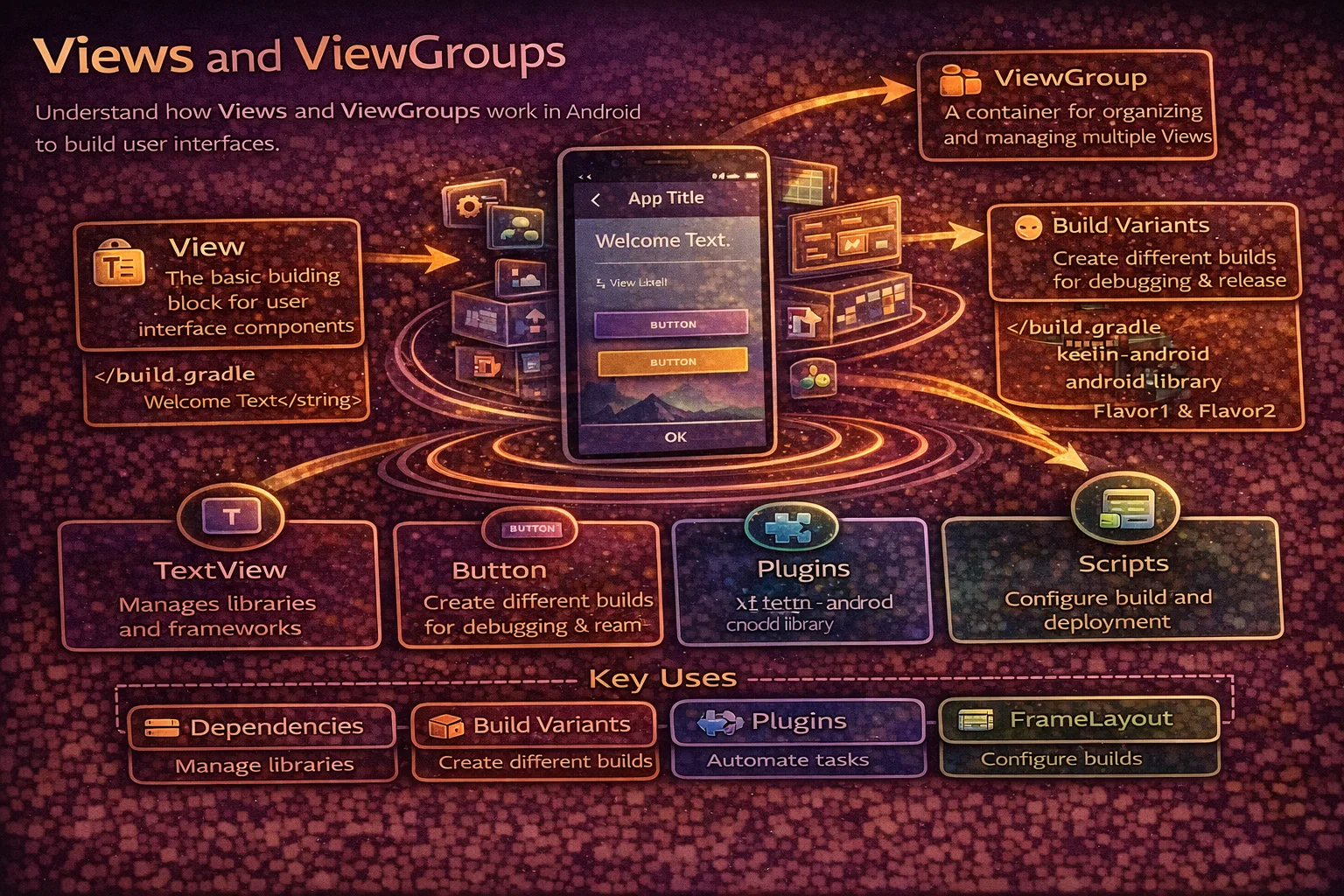
Every pixel you see on an Android screen is drawn by a View. Buttons, text, images, input fields — they’re all Views. And every View lives inside a ViewGroup that controls how it’s positioned on screen. Even if you’re moving to Jetpack Compose, understanding the View system is essential — it’s the foundation that Compose replaces, and most production apps still have XML layouts. This guide covers the View hierarchy, the most important Views and ViewGroups, how measurement and layout work, View properties, event handling, and the patterns that matter for real Android development.
What is a View?
// A View is the basic building block of Android UI
// It occupies a rectangular area on screen and handles:
// 1. DRAWING — what it looks like (text, color, shape)
// 2. MEASUREMENT — how big it should be
// 3. LAYOUT — where it's positioned
// 4. EVENT HANDLING — touch, click, keyboard input

// Every UI element is a View:
// TextView     — displays text
// Button       — clickable button (extends TextView)
// ImageView    — displays images
// EditText     — text input field (extends TextView)
// CheckBox     — check/uncheck (extends CompoundButton → Button → TextView)
// ProgressBar  — loading indicator
// RecyclerView — scrollable list (extends ViewGroup)

// The View class hierarchy:
//
//           View (base class)
//            │
//    ┌───────┼───────────────┐
//    │       │               │
// TextView  ImageView    ViewGroup
//    │                       │
// Button              ┌──────┼──────┐
//    │            LinearLayout  FrameLayout  ...
// EditText        ConstraintLayout  RecyclerView
What is a ViewGroup?
// A ViewGroup is a View that CONTAINS other Views (children)
// It defines HOW children are arranged on screen

// ViewGroup IS a View — it can be measured, drawn, and handle events
// But its main job is POSITIONING its children

// Think of it as:
// View = a widget (button, text, image)
// ViewGroup = a container that arranges widgets

// Common ViewGroups:
// LinearLayout      — arranges children in a line (horizontal or vertical)
// FrameLayout       — stacks children on top of each other
// ConstraintLayout   — positions children with constraints (most flexible)
// RelativeLayout    — positions relative to parent or siblings (legacy)
// CoordinatorLayout — for Material Design behaviors (scrolling, FAB)
// RecyclerView      — efficiently scrolls large lists
The View Tree
// Every screen is a TREE of Views — ViewGroups contain Views and other ViewGroups

// Example layout:
// ConstraintLayout (root ViewGroup)
//   ├── ImageView (avatar)
//   ├── TextView (name)
//   ├── TextView (email)
//   └── LinearLayout (buttons container)
//         ├── Button (edit)
//         └── Button (delete)

// In XML:
<ConstraintLayout>
    <ImageView android:id="@+id/avatar" />
    <TextView android:id="@+id/name" />
    <TextView android:id="@+id/email" />
    <LinearLayout android:id="@+id/buttons">
        <Button android:id="@+id/editBtn" />
        <Button android:id="@+id/deleteBtn" />
    </LinearLayout>
</ConstraintLayout>

// The system traverses this tree to:
// 1. MEASURE — calculate each View's width and height (top-down)
// 2. LAYOUT — assign each View's position (top-down)
// 3. DRAW — render each View on the canvas (top-down)

// Fewer nested ViewGroups = faster rendering
// Deep nesting causes performance problems (especially with RelativeLayout)
Essential Views
TextView — displaying text
<TextView
    android:id="@+id/titleText"
    android:layout_width="wrap_content"
    android:layout_height="wrap_content"
    android:text="@string/article_title"
    android:textSize="18sp"
    android:textColor="?attr/colorOnSurface"
    android:fontFamily="sans-serif-medium"
    android:maxLines="2"
    android:ellipsize="end"
    android:lineSpacingMultiplier="1.3" />
// In code
binding.titleText.text = "Kotlin Coroutines"
binding.titleText.setTextColor(ContextCompat.getColor(this, R.color.primary))
binding.titleText.isVisible = true // from androidx.core.viewButton — user actions
<!-- Material Button (recommended) -->
<com.google.android.material.button.MaterialButton
    android:id="@+id/submitBtn"
    android:layout_width="match_parent"
    android:layout_height="wrap_content"
    android:text="@string/submit"
    android:textAllCaps="false"
    app:cornerRadius="8dp"
    app:icon="@drawable/ic_send"
    app:iconGravity="end" />

<!-- Outlined button -->
<com.google.android.material.button.MaterialButton
    style="@style/Widget.Material3.Button.OutlinedButton"
    android:layout_width="wrap_content"
    android:layout_height="wrap_content"
    android:text="@string/cancel" />

<!-- Text button (no background) -->
<com.google.android.material.button.MaterialButton
    style="@style/Widget.Material3.Button.TextButton"
    android:layout_width="wrap_content"
    android:layout_height="wrap_content"
    android:text="@string/learn_more" />
// Click handling
binding.submitBtn.setOnClickListener {
submitForm()
}
// Disable during loading
binding.submitBtn.isEnabled = false
binding.submitBtn.text = getString(R.string.loading)ImageView — displaying images
<ImageView
    android:id="@+id/articleImage"
    android:layout_width="match_parent"
    android:layout_height="200dp"
    android:scaleType="centerCrop"
    android:contentDescription="@string/article_image_desc"
    android:src="@drawable/placeholder" />

<!-- scaleType options:
     centerCrop   — scales to fill, crops excess (most common for photos)
     fitCenter    — scales to fit inside, may have letterboxing
     centerInside — scales down to fit, never scales up
     center       — no scaling, centered
     fitXY        — stretches to fill (distorts aspect ratio — avoid) -->
// Load network images with Coil (modern) or Glide
// Coil
binding.articleImage.load("https://example.com/photo.jpg") {
placeholder(R.drawable.placeholder)
error(R.drawable.error_image)
crossfade(true)
}
// Glide
Glide.with(this)
.load("https://example.com/photo.jpg")
.placeholder(R.drawable.placeholder)
.error(R.drawable.error_image)
.centerCrop()
.into(binding.articleImage)EditText — text input
<!-- Material TextInputLayout + TextInputEditText (recommended) -->
<com.google.android.material.textfield.TextInputLayout
    android:id="@+id/nameLayout"
    android:layout_width="match_parent"
    android:layout_height="wrap_content"
    android:hint="@string/hint_name"
    app:errorEnabled="true"
    style="@style/Widget.Material3.TextInputLayout.OutlinedBox">

    <com.google.android.material.textfield.TextInputEditText
        android:id="@+id/nameInput"
        android:layout_width="match_parent"
        android:layout_height="wrap_content"
        android:inputType="textPersonName"
        android:maxLength="50"
        android:imeOptions="actionNext" />

</com.google.android.material.textfield.TextInputLayout>

<!-- inputType options:
     text              — general text
     textEmailAddress  — email keyboard layout
     textPassword      — hidden characters
     number            — numeric keyboard
     phone             — phone keyboard
     textMultiLine     — multi-line input -->
// Reading text
val name = binding.nameInput.text.toString()
// Setting error
binding.nameLayout.error = "Name is required"
binding.nameLayout.error = null // clear error
// Text change listener
binding.nameInput.doAfterTextChanged { text ->
viewModel.onNameChanged(text.toString())
}
// doAfterTextChanged is from androidx.core.widget — cleaner than TextWatcherProgressBar — loading indicators
<!-- Circular (indeterminate) -->
<ProgressBar
    android:id="@+id/loadingSpinner"
    android:layout_width="wrap_content"
    android:layout_height="wrap_content"
    android:indeterminate="true" />

<!-- Linear (determinate) -->
<com.google.android.material.progressindicator.LinearProgressIndicator
    android:id="@+id/downloadProgress"
    android:layout_width="match_parent"
    android:layout_height="wrap_content"
    android:max="100"
    app:trackThickness="4dp" />
// Show/hide
binding.loadingSpinner.isVisible = true // show
binding.loadingSpinner.isVisible = false // hide
// Update progress
binding.downloadProgress.progress = 75 // 75%Essential ViewGroups (Layouts)
LinearLayout — arrange in a line
<!-- Vertical — children stacked top to bottom -->
<LinearLayout
    android:layout_width="match_parent"
    android:layout_height="wrap_content"
    android:orientation="vertical"
    android:padding="16dp">

    <TextView
        android:layout_width="match_parent"
        android:layout_height="wrap_content"
        android:text="Title" />

    <TextView
        android:layout_width="match_parent"
        android:layout_height="wrap_content"
        android:text="Subtitle"
        android:layout_marginTop="8dp" />

</LinearLayout>

<!-- Horizontal with weight — divide space proportionally -->
<LinearLayout
    android:layout_width="match_parent"
    android:layout_height="wrap_content"
    android:orientation="horizontal">

    <Button
        android:layout_width="0dp"
        android:layout_height="wrap_content"
        android:layout_weight="1"
        android:text="Cancel" />

    <Button
        android:layout_width="0dp"
        android:layout_height="wrap_content"
        android:layout_weight="1"
        android:text="OK" />

</LinearLayout>
<!-- weight="1" + width="0dp" = each button gets 50% -->
FrameLayout — stack on top
<!-- Children are stacked — last child is on top -->
<FrameLayout
android:layout_width="match_parent"
android:layout_height="200dp">
<ImageView
android:layout_width="match_parent"
android:layout_height="match_parent"
android:scaleType="centerCrop"
android:src="@drawable/photo" />
<!-- Overlay text on top of image -->
<TextView
android:layout_width="wrap_content"
android:layout_height="wrap_content"
android:layout_gravity="bottom|start"
android:layout_margin="16dp"
android:text="Photo caption"
android:textColor="@android:color/white" />
</FrameLayout>
<!-- FrameLayout is also used as:
- Container for Fragments
- Overlay loading spinner on top of content
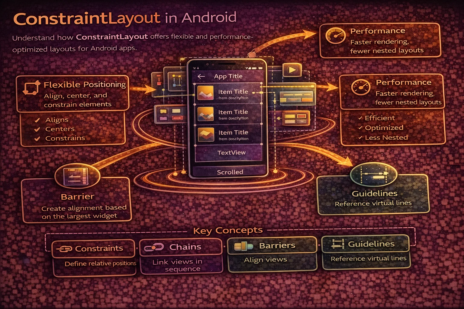
- Simple single-child container -->ConstraintLayout — the most flexible
<!-- Position Views relative to parent and each other with constraints -->
<androidx.constraintlayout.widget.ConstraintLayout
    android:layout_width="match_parent"
    android:layout_height="wrap_content"
    android:padding="16dp">

    <ImageView
        android:id="@+id/avatar"
        android:layout_width="48dp"
        android:layout_height="48dp"
        app:layout_constraintStart_toStartOf="parent"
        app:layout_constraintTop_toTopOf="parent" />

    <TextView
        android:id="@+id/name"
        android:layout_width="0dp"
        android:layout_height="wrap_content"
        android:layout_marginStart="12dp"
        app:layout_constraintStart_toEndOf="@id/avatar"
        app:layout_constraintEnd_toEndOf="parent"
        app:layout_constraintTop_toTopOf="@id/avatar"
        android:text="Alice Johnson" />

    <TextView
        android:id="@+id/email"
        android:layout_width="0dp"
        android:layout_height="wrap_content"
        app:layout_constraintStart_toStartOf="@id/name"
        app:layout_constraintEnd_toEndOf="parent"
        app:layout_constraintTop_toBottomOf="@id/name"
        android:text="alice@example.com" />

</androidx.constraintlayout.widget.ConstraintLayout>

<!-- ConstraintLayout advantages:
     - FLAT hierarchy (no nesting needed) — better performance
     - Handles complex layouts that would need nested LinearLayouts
     - Chains, barriers, guidelines for advanced positioning
     - Recommended as the DEFAULT root layout -->
ScrollView & NestedScrollView — scrollable content
<!-- ScrollView can have ONLY ONE direct child -->
<androidx.core.widget.NestedScrollView
    android:layout_width="match_parent"
    android:layout_height="match_parent">

    <LinearLayout
        android:layout_width="match_parent"
        android:layout_height="wrap_content"
        android:orientation="vertical">

        <!-- All your content here -->
        <TextView ... />
        <ImageView ... />
        <TextView ... />

    </LinearLayout>

</androidx.core.widget.NestedScrollView>

<!-- Use NestedScrollView (not ScrollView) when you have:
     - CoordinatorLayout with collapsing toolbar
     - RecyclerView inside a scrollable parent
     NestedScrollView supports nested scrolling properly -->
layout_width and layout_height
// Every View MUST specify width and height
// Three options:

// match_parent — fill the entire parent
android:layout_width="match_parent"    // as wide as parent allows

// wrap_content — just big enough for its content
android:layout_width="wrap_content"    // shrinks to fit text/image

// Fixed size — exact dimension in dp
android:layout_width="200dp"           // exactly 200dp wide

// 0dp (in ConstraintLayout) — match constraints
android:layout_width="0dp"             // expand to fill constraints
// This means "my width is defined by my start and end constraints"

// ⚠️ Common mistake:
// ❌ match_parent in ConstraintLayout child — doesn't work correctly
// ✅ Use 0dp with constraints to parent start and end instead
Margin vs Padding
// MARGIN — space OUTSIDE the View (between View and its neighbors/parent)
// PADDING — space INSIDE the View (between View border and its content)

// ┌──────────────────────── Parent ────────────────────────┐
// │                                                         │
// │    ←margin→ ┌─── View ───────────────────┐ ←margin→    │
// │             │                             │             │
// │             │  ←pad→  CONTENT  ←pad→      │             │
// │             │                             │             │
// │             └─────────────────────────────┘             │
// │                                                         │
// └─────────────────────────────────────────────────────────┘

<TextView
    android:layout_width="match_parent"
    android:layout_height="wrap_content"
    android:layout_margin="16dp"
    android:padding="12dp"
    android:text="Hello" />

<!-- Individual sides -->
android:layout_marginStart="16dp"
android:layout_marginTop="8dp"
android:paddingStart="12dp"
android:paddingBottom="8dp"

<!-- Horizontal/Vertical -->
android:layout_marginHorizontal="16dp"
android:paddingVertical="8dp"
View IDs and ViewBinding
View IDs
<!-- Assign an ID to reference the View in code -->
<TextView
    android:id="@+id/titleText"
    ... />

<!-- @+id/name — creates a new ID
     @id/name  — references an existing ID (used in constraints) -->

<!-- IDs must be unique within the same layout file
     Convention: camelCase (titleText, submitButton, avatarImage) -->
ViewBinding — type-safe View access
// Enable in build.gradle.kts
android {
    buildFeatures {
        viewBinding = true
    }
}

// For activity_main.xml, ViewBinding generates ActivityMainBinding
class MainActivity : AppCompatActivity() {

    private lateinit var binding: ActivityMainBinding

    override fun onCreate(savedInstanceState: Bundle?) {
        super.onCreate(savedInstanceState)
        binding = ActivityMainBinding.inflate(layoutInflater)
        setContentView(binding.root)

        // Access Views directly — type-safe, no findViewById
        binding.titleText.text = "Hello"
        binding.submitButton.setOnClickListener { submit() }
        binding.avatarImage.load("https://example.com/avatar.jpg")
    }
}

// Benefits over findViewById:
// - Null safety — binding fields match layout, no wrong IDs
// - Type safety — binding.titleText is already typed as TextView
// - No runtime crashes from wrong casts or missing Views
// - Generated at compile time — zero runtime overhead
Visibility
// Three visibility states:

// VISIBLE — View is shown and takes up space
android:visibility="visible"
view.visibility = View.VISIBLE

// INVISIBLE — View is hidden but STILL takes up space (empty gap)
android:visibility="invisible"
view.visibility = View.INVISIBLE

// GONE — View is hidden and takes up NO space (collapsed)
android:visibility="gone"
view.visibility = View.GONE

// Using Kotlin extensions (from androidx.core.view):
view.isVisible = true       // VISIBLE
view.isVisible = false      // GONE
view.isInvisible = true     // INVISIBLE
view.isInvisible = false    // VISIBLE

// Common pattern — show/hide loading
fun setLoading(loading: Boolean) {
    binding.progressBar.isVisible = loading
    binding.content.isVisible = !loading
}
Click and Touch Handling
// Click listener — single tap
binding.button.setOnClickListener {
    navigateToDetail()
}

// Long click listener
binding.item.setOnLongClickListener {
    showContextMenu()
    true   // return true if handled
}

// Preventing double clicks (common bug)
fun View.setOnSingleClickListener(interval: Long = 600, action: () -> Unit) {
    var lastClickTime = 0L
    setOnClickListener {
        val now = System.currentTimeMillis()
        if (now - lastClickTime >= interval) {
            lastClickTime = now
            action()
        }
    }
}

binding.submitBtn.setOnSingleClickListener {
    submitOrder()   // won't fire twice on double-tap
}

// Ripple effect — add clickable + focusable for visual feedback
android:clickable="true"
android:focusable="true"
android:background="?attr/selectableItemBackground"     // bounded ripple
android:foreground="?attr/selectableItemBackground"     // ripple over content
How View Rendering Works
// Every frame (16ms for 60fps), the system walks the View tree in three passes:

// PASS 1: MEASURE (top-down)
// Each ViewGroup asks its children: "how big do you want to be?"
// Children report their desired size based on content and constraints
// ViewGroup decides final sizes based on its rules (linear, constraint, etc.)
// Result: each View knows its measured width and height

// PASS 2: LAYOUT (top-down)
// Each ViewGroup tells children: "your position is (x, y)"
// Children are placed at their assigned coordinates
// Result: each View knows its position on screen

// PASS 3: DRAW (top-down)
// Each View draws itself onto a Canvas
// Background → content → foreground → children (for ViewGroups)
// Result: pixels on screen

// You can force these passes manually:
view.requestLayout()      // triggers measure + layout (size/position changed)
view.invalidate()         // triggers draw only (appearance changed)
// But usually the system handles this automatically

// Performance tip: deep nesting = more measure/layout passes = slower
// ConstraintLayout with flat hierarchy = fewer passes = faster
Common Mistakes to Avoid
Mistake 1: Deep nesting with LinearLayouts
<!-- ❌ Nested LinearLayouts — multiple measure passes, slow -->
<LinearLayout>
    <LinearLayout>
        <LinearLayout>
            <TextView />
            <ImageView />
        </LinearLayout>
    </LinearLayout>
</LinearLayout>

<!-- ✅ Flat ConstraintLayout — single measure pass -->
<ConstraintLayout>
    <TextView />
    <ImageView />
</ConstraintLayout>
Mistake 2: Using match_parent in ConstraintLayout children
<!-- ❌ match_parent doesn't work correctly in ConstraintLayout -->
<TextView
    android:layout_width="match_parent"
    app:layout_constraintStart_toStartOf="parent"
    app:layout_constraintEnd_toEndOf="parent" />

<!-- ✅ Use 0dp with constraints -->
<TextView
    android:layout_width="0dp"
    app:layout_constraintStart_toStartOf="parent"
    app:layout_constraintEnd_toEndOf="parent" />
Mistake 3: Missing contentDescription on ImageView
<!-- ❌ No accessibility description — TalkBack can't describe the image -->
<ImageView android:src="@drawable/profile_photo" />

<!-- ✅ Always add contentDescription -->
<ImageView
    android:src="@drawable/profile_photo"
    android:contentDescription="@string/profile_photo_desc" />

<!-- For decorative images that don't convey information -->
<ImageView
    android:src="@drawable/decorative_divider"
    android:importantForAccessibility="no" />
Mistake 4: Using hardcoded dimensions and colors
<!-- ❌ Hardcoded — doesn't adapt to different screens or themes -->
<TextView
    android:layout_margin="16px"
    android:textSize="14px"
    android:textColor="#000000" />

<!-- ✅ Use resources — adapts to density, font size, and theme -->
<TextView
    android:layout_margin="@dimen/spacing_md"
    android:textSize="@dimen/text_body"
    android:textColor="?attr/colorOnSurface" />
Mistake 5: Not using ViewBinding
// ❌ findViewById — runtime crashes, no type safety
val title = findViewById<TextView>(R.id.titleText)
// Can crash if ID doesn't exist or wrong type cast

// ❌ Kotlin synthetics (deprecated and removed)
import kotlinx.android.synthetic.main.activity_main.*
titleText.text = "Hello"   // no longer supported

// ✅ ViewBinding — compile-time safe, null-safe
binding.titleText.text = "Hello"
Summary
- A View is the basic UI element (text, button, image); a ViewGroup is a container that arranges child Views
- Every screen is a tree of Views — the system traverses it to measure, layout, and draw each frame
- ConstraintLayout is the recommended root layout — flat hierarchy, single measure pass, most flexible
- LinearLayout arranges children in a line; FrameLayout stacks them; avoid deep nesting
- Every View needs
layout_widthandlayout_height— usematch_parent,wrap_content, or a fixed dp value - In ConstraintLayout, use
0dp(match constraints) instead ofmatch_parent - Margin is space outside the View; padding is space inside the View
- Use ViewBinding for type-safe, null-safe View access — never use
findViewById - Three visibility states: VISIBLE (shown), INVISIBLE (hidden, takes space), GONE (hidden, no space)
- Use
isVisibleandisInvisibleKotlin extensions for cleaner visibility control - Use Material Components (MaterialButton, TextInputLayout) for modern, themed widgets
- Always set
contentDescriptionon ImageViews for accessibility - Use resource references (
@dimen/,@color/,?attr/) instead of hardcoded values - Use image loading libraries (Coil or Glide) for network images — never load manually on the main thread
Views and ViewGroups are the foundation of Android UI. Even as Compose becomes the standard, understanding the View system helps you work with existing codebases, build custom components, and debug layout performance. Start with ConstraintLayout for flat hierarchies, use ViewBinding for safe access, and follow Material Design guidelines for a polished user experience.
Happy coding!
Comments (0)