In XML, ConstraintLayout is the default choice for every layout. In Compose, Column, Row, and Box handle most layouts without nesting penalties. But there are still cases where ConstraintLayout shines in Compose — complex overlapping layouts, percentage-based positioning, circular positioning, and layouts where multiple elements have interdependent positions. This guide covers ConstraintLayout in Compose from setup to advanced features like chains, barriers, and guidelines.
When to Use ConstraintLayout in Compose
// In XML: ConstraintLayout was needed to avoid nested LinearLayouts (performance)
// In Compose: nesting Column/Row has NO performance penalty — measure is single-pass

// So WHEN should you use ConstraintLayout in Compose?

// ✅ USE ConstraintLayout when:
// - Multiple elements reference EACH OTHER's positions (complex interdependencies)
// - You need percentage-based sizing that Column/Row can't express
// - You need circular positioning (angle + distance from center)
// - You're porting a complex XML ConstraintLayout to Compose
// - You need barriers or guidelines for dynamic alignment

// ❌ DON'T USE ConstraintLayout when:
// - Simple vertical/horizontal list → use Column/Row
// - Stacking elements → use Box
// - Proportional sizing → use weight() in Row/Column
// - Most standard layouts → Column + Row + Box is cleaner

// Rule of thumb: start with Column/Row/Box
// Switch to ConstraintLayout only when those get awkward
Setup
// build.gradle.kts
dependencies {
implementation("androidx.constraintlayout:constraintlayout-compose:1.1.0")
}
// This is a SEPARATE library from the XML ConstraintLayout
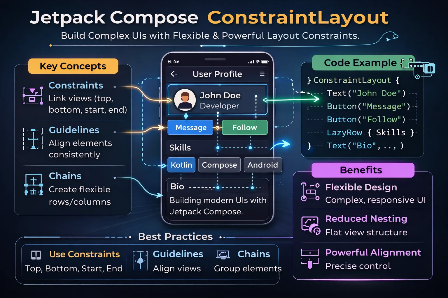
// The API is completely different — Compose-native, uses refs and constraintsBasic Usage — createRefs and constrainAs
@Composable
fun BasicConstraintExample() {
    ConstraintLayout(
        // ConstraintLayout is a COMPOSABLE FUNCTION
        // from androidx.constraintlayout.compose
        modifier = Modifier.fillMaxSize().padding(16.dp)
    ) {
        // Step 1: Create references for each composable
        val (title, subtitle, avatar) = createRefs()
        // createRefs() is a FUNCTION on ConstraintLayoutScope
        // Returns multiple ConstrainedLayoutReference objects
        // ConstrainedLayoutReference is a CLASS — an ID for a composable in the layout

        // Step 2: Use constrainAs modifier to position each composable
        Image(
            painter = painterResource(R.drawable.avatar),
            contentDescription = "Avatar",
            modifier = Modifier
                .size(48.dp)
                .clip(CircleShape)
                .constrainAs(avatar) {
                    // constrainAs() is an EXTENSION FUNCTION on Modifier
                    // available ONLY inside ConstraintLayoutScope
                    // The lambda receiver is ConstrainScope — provides constraint functions
                    top.linkTo(parent.top)
                    start.linkTo(parent.start)
                    // linkTo() is a FUNCTION on ConstraintLayoutScope's dimension references
                    // parent is a PROPERTY on ConstrainScope — reference to the ConstraintLayout
                }
        )

        Text(
            text = "Alice Johnson",
            style = MaterialTheme.typography.titleMedium,
            modifier = Modifier.constrainAs(title) {
                top.linkTo(avatar.top)
                // Links this composable's top to avatar's top — vertically aligned
                start.linkTo(avatar.end, margin = 12.dp)
                // Links start to avatar's end with 12dp margin
                end.linkTo(parent.end)
                width = Dimension.fillToConstraints
                // Dimension is a CLASS from constraintlayout-compose
                // fillToConstraints is equivalent to 0dp in XML ConstraintLayout
                // Width fills the space between start and end constraints
            }
        )

        Text(
            text = "alice@example.com",
            style = MaterialTheme.typography.bodySmall,
            color = MaterialTheme.colorScheme.onSurfaceVariant,
            modifier = Modifier.constrainAs(subtitle) {
                top.linkTo(title.bottom, margin = 4.dp)
                start.linkTo(title.start)
                end.linkTo(parent.end)
                width = Dimension.fillToConstraints
            }
        )
    }
}
createRef vs createRefs
// Single reference
val title = createRef()
// createRef() is a FUNCTION on ConstraintLayoutScope
// Returns a single ConstrainedLayoutReference

// Multiple references via destructuring
val (title, subtitle, avatar) = createRefs()
// createRefs() returns a ConstraintLayoutScope.ConstrainedLayoutReferences
// Supports destructuring up to 16 references

// Usage is identical:
Text(modifier = Modifier.constrainAs(title) { /* constraints */ })
Text(modifier = Modifier.constrainAs(subtitle) { /* constraints */ })
Constraint Functions — linkTo and centerTo
// Inside constrainAs { } block, you have access to:
// top, bottom, start, end — the four sides of the composable
// parent — reference to the ConstraintLayout itself

Modifier.constrainAs(ref) {
    // ═══ linkTo — connect one side to another ═══════════════════
    top.linkTo(parent.top)                    // top edge to parent top
    start.linkTo(parent.start, margin = 16.dp)  // with margin
    end.linkTo(otherRef.start, margin = 8.dp)   // to another composable
    bottom.linkTo(parent.bottom)

    // ═══ centerTo — center on an axis ═══════════════════════════
    // Center horizontally in parent
    start.linkTo(parent.start)
    end.linkTo(parent.end)
    // or use:
    centerHorizontallyTo(parent)
    // centerHorizontallyTo() is a FUNCTION on ConstrainScope

    // Center vertically in parent
    centerVerticallyTo(parent)

    // Center both axes
    centerTo(parent)
    // centerTo() is a FUNCTION on ConstrainScope

    // Center relative to another composable
    centerVerticallyTo(avatar)   // vertically aligned with avatar

    // ═══ Width and Height ═══════════════════════════════════════
    width = Dimension.fillToConstraints   // 0dp — fill between constraints
    width = Dimension.wrapContent         // wrap_content
    width = Dimension.value(200.dp)       // fixed size
    width = Dimension.preferredWrapContent // wrap but respect constraints
    width = Dimension.percent(0.5f)       // 50% of parent width

    height = Dimension.fillToConstraints
    height = Dimension.wrapContent
    height = Dimension.ratio("16:9")      // aspect ratio
    // Dimension is a CLASS with companion factory functions/properties
}
Dimension Options
// Dimension is a CLASS from constraintlayout-compose
// It controls how width/height is calculated

// Dimension.wrapContent — shrink to content (like wrap_content)
width = Dimension.wrapContent

// Dimension.fillToConstraints — fill between constraints (like 0dp in XML)
width = Dimension.fillToConstraints

// Dimension.value(100.dp) — exact fixed size
width = Dimension.value(100.dp)

// Dimension.preferredWrapContent — wrap content but respect min/max from constraints
width = Dimension.preferredWrapContent

// Dimension.percent(0.5f) — percentage of parent
width = Dimension.percent(0.5f)    // 50% of parent width
height = Dimension.percent(0.3f)   // 30% of parent height

// Dimension.ratio("16:9") — aspect ratio
// One dimension must be Dimension.fillToConstraints or constrained
width = Dimension.fillToConstraints
height = Dimension.ratio("16:9")   // height = width * (9/16)

// Dimension.preferredValue(100.dp) — prefers 100dp but respects constraints
width = Dimension.preferredValue(100.dp)
Chains
Chains distribute multiple composables along an axis — equivalent to chains in XML ConstraintLayout:
@Composable
fun ChainExample() {
    ConstraintLayout(modifier = Modifier.fillMaxWidth().padding(16.dp)) {
        val (btn1, btn2, btn3) = createRefs()

        // Create a horizontal chain
        createHorizontalChain(btn1, btn2, btn3, chainStyle = ChainStyle.Spread)
        // createHorizontalChain() is a FUNCTION on ConstraintLayoutScope
        // ChainStyle is a CLASS with predefined chain styles:
        //   ChainStyle.Spread        — evenly distributed (default)
        //   ChainStyle.SpreadInside  — first/last at edges, space between
        //   ChainStyle.Packed        — grouped together in the center
        //   ChainStyle.Packed(bias)  — packed with horizontal bias (0f–1f)

        Button(
            onClick = {},
            modifier = Modifier.constrainAs(btn1) {
                top.linkTo(parent.top)
            }
        ) { Text("One") }

        Button(
            onClick = {},
            modifier = Modifier.constrainAs(btn2) {
                top.linkTo(parent.top)
            }
        ) { Text("Two") }

        Button(
            onClick = {},
            modifier = Modifier.constrainAs(btn3) {
                top.linkTo(parent.top)
            }
        ) { Text("Three") }
    }
}

// ═══ Chain Styles Visualised ═════════════════════════════════════════
//
//  Spread (default):
//  |   [One]   [Two]   [Three]   |
//     equal space around each
//
//  SpreadInside:
//  |[One]      [Two]      [Three]|
//   edges touch, equal space between
//
//  Packed:
//  |      [One][Two][Three]      |
//   grouped in center
//
//  Packed(bias = 0f):
//  |[One][Two][Three]            |
//   grouped at start

// Vertical chain:
createVerticalChain(title, subtitle, body, chainStyle = ChainStyle.Packed)
// createVerticalChain() is a FUNCTION on ConstraintLayoutScope
Guidelines
A guideline is an invisible positioning line — composables can constrain to it:
@Composable
fun GuidelineExample() {
    ConstraintLayout(modifier = Modifier.fillMaxSize()) {
        // Vertical guideline at 30% from start
        val startGuideline = createGuidelineFromStart(0.3f)
        // createGuidelineFromStart() is a FUNCTION on ConstraintLayoutScope
        // 0.3f = 30% from the start edge
        // Returns ConstrainedLayoutReference — can be used in constraints

        // Horizontal guideline at 64dp from top
        val topGuideline = createGuidelineFromTop(64.dp)
        // createGuidelineFromTop() accepts Dp or Float (fraction)

        val (label, content) = createRefs()

        Text(
            text = "Label:",
            modifier = Modifier.constrainAs(label) {
                end.linkTo(startGuideline, margin = 8.dp)
                top.linkTo(topGuideline)
            }
        )

        Text(
            text = "Content value here",
            modifier = Modifier.constrainAs(content) {
                start.linkTo(startGuideline, margin = 8.dp)
                top.linkTo(topGuideline)
                end.linkTo(parent.end, margin = 16.dp)
                width = Dimension.fillToConstraints
            }
        )
    }
}

// Guideline functions:
// createGuidelineFromStart(fraction)  — vertical, fraction from start (0f–1f)
// createGuidelineFromStart(offset)    — vertical, fixed dp from start
// createGuidelineFromEnd(fraction)    — vertical, fraction from end
// createGuidelineFromTop(fraction)    — horizontal, fraction from top
// createGuidelineFromTop(offset)      — horizontal, fixed dp from top
// createGuidelineFromBottom(fraction) — horizontal, fraction from bottom
// All are FUNCTIONS on ConstraintLayoutScope
Barriers
A barrier positions itself at the most extreme edge of a group of composables — it moves dynamically based on content size:
@Composable
fun BarrierExample() {
    ConstraintLayout(modifier = Modifier.fillMaxWidth().padding(16.dp)) {
        val (labelName, labelEmail, labelPhone, valueName, valueEmail, valuePhone) = createRefs()

        // Labels (varying width)
        Text("Name:", modifier = Modifier.constrainAs(labelName) {
            top.linkTo(parent.top)
            start.linkTo(parent.start)
        })
        Text("Email:", modifier = Modifier.constrainAs(labelEmail) {
            top.linkTo(labelName.bottom, margin = 8.dp)
            start.linkTo(parent.start)
        })
        Text("Phone number:", modifier = Modifier.constrainAs(labelPhone) {
            top.linkTo(labelEmail.bottom, margin = 8.dp)
            start.linkTo(parent.start)
        })

        // Barrier sits at the END of the widest label
        val labelBarrier = createEndBarrier(labelName, labelEmail, labelPhone, margin = 12.dp)
        // createEndBarrier() is a FUNCTION on ConstraintLayoutScope
        // Returns ConstrainedLayoutReference positioned at the rightmost edge
        // of all referenced composables + margin
        // Moves dynamically — if "Phone number:" gets longer, barrier adjusts

        // Values constrained to the barrier — always start after the widest label
        Text("Alice Johnson", modifier = Modifier.constrainAs(valueName) {
            top.linkTo(labelName.top)
            start.linkTo(labelBarrier)
        })
        Text("alice@example.com", modifier = Modifier.constrainAs(valueEmail) {
            top.linkTo(labelEmail.top)
            start.linkTo(labelBarrier)
        })
        Text("+1 234 567 8900", modifier = Modifier.constrainAs(valuePhone) {
            top.linkTo(labelPhone.top)
            start.linkTo(labelBarrier)
        })
    }
}

// ═══ Barrier Visualised ══════════════════════════════════════════════
//
//  Name:          |  Alice Johnson
//  Email:         |  alice@example.com
//  Phone number:  |  +1 234 567 8900
//                 ↑
//          barrier sits here (after widest label)
//          moves right if any label gets longer

// Barrier functions:
// createStartBarrier(ref1, ref2, ...)  — barrier at leftmost edge
// createEndBarrier(ref1, ref2, ...)    — barrier at rightmost edge
// createTopBarrier(ref1, ref2, ...)    — barrier at topmost edge
// createBottomBarrier(ref1, ref2, ...) — barrier at bottommost edge
// All accept optional margin parameter
// All are FUNCTIONS on ConstraintLayoutScope
Aspect Ratio and Percentage Sizing
@Composable
fun AspectRatioExample() {
    ConstraintLayout(modifier = Modifier.fillMaxWidth()) {
        val image = createRef()

        // 16:9 image that fills parent width
        AsyncImage(
            model = "https://example.com/photo.jpg",
            contentDescription = "Cover photo",
            contentScale = ContentScale.Crop,
            modifier = Modifier.constrainAs(image) {
                top.linkTo(parent.top)
                start.linkTo(parent.start)
                end.linkTo(parent.end)
                width = Dimension.fillToConstraints
                height = Dimension.ratio("16:9")
                // ratio() is a FUNCTION on Dimension companion
                // Width fills constraints, height is calculated from aspect ratio
            }
        )
    }
}

@Composable
fun PercentageSizingExample() {
    ConstraintLayout(modifier = Modifier.fillMaxSize()) {
        val card = createRef()

        Card(
            modifier = Modifier.constrainAs(card) {
                centerTo(parent)
                width = Dimension.percent(0.8f)    // 80% of parent width
                height = Dimension.percent(0.5f)   // 50% of parent height
            }
        ) {
            Text("80% x 50% card", modifier = Modifier.padding(16.dp))
        }
    }
}
ConstraintSet — Decoupled Constraints
For complex layouts or animations, you can define constraints separately from composables using a ConstraintSet:
@Composable
fun ConstraintSetExample() {
    // Define constraints separately
    val constraints = ConstraintSet {
        // ConstraintSet() is a TOP-LEVEL FUNCTION that creates a constraint set
        // The lambda receiver is ConstraintSetScope

        val avatar = createRefFor("avatar")
        val name = createRefFor("name")
        val email = createRefFor("email")
        // createRefFor() is a FUNCTION on ConstraintSetScope
        // Takes a String ID that matches layoutId in the composable

        constrain(avatar) {
            // constrain() is a FUNCTION on ConstraintSetScope
            top.linkTo(parent.top)
            start.linkTo(parent.start)
        }

        constrain(name) {
            top.linkTo(avatar.top)
            start.linkTo(avatar.end, margin = 12.dp)
            end.linkTo(parent.end)
            width = Dimension.fillToConstraints
        }

        constrain(email) {
            top.linkTo(name.bottom, margin = 4.dp)
            start.linkTo(name.start)
        }
    }

    ConstraintLayout(
        constraintSet = constraints,   // pass the constraint set
        modifier = Modifier.fillMaxWidth().padding(16.dp)
    ) {
        Image(
            painter = painterResource(R.drawable.avatar),
            contentDescription = null,
            modifier = Modifier
                .layoutId("avatar")   // must match createRefFor("avatar")
                // layoutId() is an EXTENSION FUNCTION on Modifier
                .size(48.dp)
                .clip(CircleShape)
        )

        Text(
            text = "Alice Johnson",
            modifier = Modifier.layoutId("name")
        )

        Text(
            text = "alice@example.com",
            modifier = Modifier.layoutId("email")
        )
    }
}

// Benefits of ConstraintSet:
// - Constraints are separate from UI — can swap constraint sets for animations
// - Can be reused across composables
// - Better for very complex layouts with many interdependencies
// - Required for MotionLayout animations
Real-World Example — Article Card
@Composable
fun ArticleCard(article: Article, onClick: () -> Unit) {
    Card(
        onClick = onClick,
        modifier = Modifier.fillMaxWidth()
    ) {
        ConstraintLayout(
            modifier = Modifier.fillMaxWidth().padding(16.dp)
        ) {
            val (image, title, author, date, bookmark) = createRefs()

            // Cover image — 16:9
            AsyncImage(
                model = article.imageUrl,
                contentDescription = null,
                contentScale = ContentScale.Crop,
                modifier = Modifier
                    .clip(RoundedCornerShape(8.dp))
                    .constrainAs(image) {
                        top.linkTo(parent.top)
                        start.linkTo(parent.start)
                        end.linkTo(parent.end)
                        width = Dimension.fillToConstraints
                        height = Dimension.ratio("16:9")
                    }
            )

            // Title — below image, full width minus bookmark space
            Text(
                text = article.title,
                style = MaterialTheme.typography.titleMedium,
                maxLines = 2,
                overflow = TextOverflow.Ellipsis,
                modifier = Modifier.constrainAs(title) {
                    top.linkTo(image.bottom, margin = 12.dp)
                    start.linkTo(parent.start)
                    end.linkTo(bookmark.start, margin = 8.dp)
                    width = Dimension.fillToConstraints
                }
            )

            // Author — below title
            Text(
                text = article.author,
                style = MaterialTheme.typography.bodySmall,
                color = MaterialTheme.colorScheme.onSurfaceVariant,
                modifier = Modifier.constrainAs(author) {
                    top.linkTo(title.bottom, margin = 4.dp)
                    start.linkTo(parent.start)
                }
            )

            // Date — to the right of author
            Text(
                text = article.formattedDate,
                style = MaterialTheme.typography.bodySmall,
                color = MaterialTheme.colorScheme.onSurfaceVariant,
                modifier = Modifier.constrainAs(date) {
                    baseline.linkTo(author.baseline)
                    // baseline constrains text baselines — keeps text aligned
                    start.linkTo(author.end, margin = 8.dp)
                }
            )

            // Bookmark button — right side, vertically centered with title
            IconButton(
                onClick = { /* toggle bookmark */ },
                modifier = Modifier.constrainAs(bookmark) {
                    top.linkTo(title.top)
                    bottom.linkTo(author.bottom)
                    end.linkTo(parent.end)
                }
            ) {
                Icon(
                    imageVector = if (article.isBookmarked) Icons.Filled.Bookmark
                        else Icons.Outlined.BookmarkBorder,
                    contentDescription = "Bookmark"
                )
            }
        }
    }
}
ConstraintLayout vs Column/Row/Box — When to Use Which
// ┌──────────────────────────┬──────────────────┬────────────────────────┐
// │ Use Case                 │ Column/Row/Box   │ ConstraintLayout       │
// ├──────────────────────────┼──────────────────┼────────────────────────┤
// │ Simple vertical list     │ ✅ Column         │ ❌ Overkill             │
// │ Simple horizontal items  │ ✅ Row            │ ❌ Overkill             │
// │ Overlapping elements     │ ✅ Box            │ ✅ Also works           │
// │ Proportional sizing      │ ✅ weight()       │ ✅ percent()            │
// │ Baseline text alignment  │ ⚠️ Harder        │ ✅ Easy (baseline)      │
// │ Complex interdependency  │ ⚠️ Nested mess   │ ✅ Clean flat layout    │
// │ Percentage positioning   │ ❌ Not supported  │ ✅ percent/guideline    │
// │ Dynamic alignment        │ ❌ No barriers    │ ✅ Barriers             │
// │ Aspect ratio layouts     │ ⚠️ aspectRatio() │ ✅ ratio()              │
// │ Animation between states │ ❌ Not built-in   │ ✅ MotionLayout         │
// │ Performance              │ ✅ Fastest        │ ⚠️ Slightly slower     │
// └──────────────────────────┴──────────────────┴────────────────────────┘
//
// Start with Column/Row/Box → switch to ConstraintLayout only when needed
Common Mistakes to Avoid
Mistake 1: Using ConstraintLayout for simple layouts
// ❌ Overkill — ConstraintLayout for a simple vertical list
ConstraintLayout {
    val (a, b, c) = createRefs()
    Text("First", modifier = Modifier.constrainAs(a) { top.linkTo(parent.top) })
    Text("Second", modifier = Modifier.constrainAs(b) { top.linkTo(a.bottom) })
    Text("Third", modifier = Modifier.constrainAs(c) { top.linkTo(b.bottom) })
}

// ✅ Column is simpler and faster
Column {
    Text("First")
    Text("Second")
    Text("Third")
}
Mistake 2: Forgetting to set width = Dimension.fillToConstraints
// ❌ Text wraps content — doesn't fill the space between constraints
Text(
    text = longText,
    modifier = Modifier.constrainAs(title) {
        start.linkTo(avatar.end, margin = 12.dp)
        end.linkTo(parent.end)
        // width defaults to wrapContent — text might overflow!
    }
)

// ✅ fillToConstraints makes text fill the available space
Text(
    text = longText,
    modifier = Modifier.constrainAs(title) {
        start.linkTo(avatar.end, margin = 12.dp)
        end.linkTo(parent.end)
        width = Dimension.fillToConstraints   // fills between start and end
    },
    maxLines = 2,
    overflow = TextOverflow.Ellipsis
)
Mistake 3: Mixing layoutId and constrainAs
// ❌ Using both constrainAs AND layoutId on the same composable
Text(
    modifier = Modifier
        .layoutId("title")
        .constrainAs(titleRef) { /* ... */ }   // conflict!
)

// ✅ Use ONE approach:
// Inline constraints → constrainAs(ref) { }
// Decoupled constraints → layoutId("id") + ConstraintSet
// Never mix both on the same composable
Mistake 4: Missing constraints on an axis
// ❌ No vertical constraint — composable position is undefined
Text(modifier = Modifier.constrainAs(title) {
    start.linkTo(parent.start)
    end.linkTo(parent.end)
    // No top or bottom constraint! Position defaults to top = 0
})

// ✅ Always constrain both axes
Text(modifier = Modifier.constrainAs(title) {
    start.linkTo(parent.start)
    end.linkTo(parent.end)
    top.linkTo(avatar.bottom, margin = 8.dp)   // vertical constraint
    width = Dimension.fillToConstraints
})
Summary
- ConstraintLayout (composable function) is from a separate library:
constraintlayout-compose - Use it for complex interdependent layouts, percentage sizing, barriers, guidelines — not for simple Column/Row layouts
createRef()andcreateRefs()are functions on ConstraintLayoutScope that create references for composablesconstrainAs(ref) { }is an extension function on Modifier that positions a composable using constraintslinkTo()connects one side (top/bottom/start/end) to another composable’s side or the parentcenterTo(),centerHorizontallyTo(),centerVerticallyTo()are functions on ConstrainScope for centering- Dimension (class) controls width/height:
fillToConstraints,wrapContent,percent(),ratio(),value() - Chains —
createHorizontalChain()/createVerticalChain()with ChainStyle (Spread, SpreadInside, Packed) - Guidelines —
createGuidelineFromStart/End/Top/Bottom()for invisible positioning lines - Barriers —
createStartBarrier/EndBarrier/TopBarrier/BottomBarrier()for dynamic edges based on content - ConstraintSet (top-level function) decouples constraints from composables using
layoutId()— needed for MotionLayout - baseline constraint aligns text baselines across composables
- Start with Column/Row/Box — switch to ConstraintLayout only when those become awkward
ConstraintLayout in Compose is a power tool, not a default choice. In XML it was essential for performance — in Compose it’s a specialized tool for complex layouts that Column, Row, and Box can’t express cleanly. Master the basics (refs, constrainAs, linkTo, Dimension), and reach for barriers, guidelines, and chains when you need them.
Happy coding!


Comments (0)