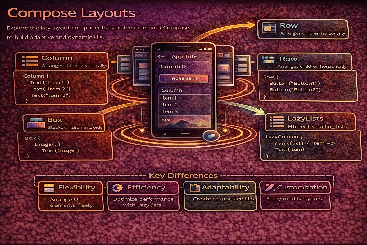
In XML, you choose between LinearLayout, FrameLayout, ConstraintLayout, and RecyclerView to arrange Views. In Compose, you have composable functions that do the same thing but with less boilerplate and more flexibility. Column arranges vertically, Row arranges horizontally, Box stacks on top, and LazyColumn handles scrollable lists efficiently. This guide covers every layout composable you need — with precise identification of every keyword, Arrangement, Alignment, weight, and practical patterns.
Column — Vertical Layout
Column is a composable inline function that places children vertically, top to bottom. It’s the Compose equivalent of LinearLayout(vertical).
@Composable
fun ColumnExample() {
    Column(
        // Column is a COMPOSABLE INLINE FUNCTION from compose.foundation.layout
        modifier = Modifier
            .fillMaxWidth()
            .padding(16.dp),
        verticalArrangement = Arrangement.spacedBy(8.dp),
        // Arrangement is an OBJECT from compose.foundation.layout
        // spacedBy() is a FUNCTION on Arrangement that returns Arrangement.Vertical
        // It adds fixed spacing BETWEEN children (not before first or after last)
        horizontalAlignment = Alignment.CenterHorizontally
        // Alignment is a CLASS from compose.ui
        // CenterHorizontally is a STATIC PROPERTY on Alignment.Horizontal companion
    ) {
        // Everything inside is placed top to bottom
        Text("First")
        Text("Second")
        Text("Third")
    }
}

// Arrangement options for Column (vertical):
// Arrangement.Top              — children packed at the top (default)
// Arrangement.Bottom           — children packed at the bottom
// Arrangement.Center           — children centered vertically
// Arrangement.SpaceBetween     — first at top, last at bottom, even space between
// Arrangement.SpaceAround      — even space around each child
// Arrangement.SpaceEvenly      — even space between, before, and after
// Arrangement.spacedBy(8.dp)   — fixed gap between children

// Alignment options for Column (horizontal alignment of children):
// Alignment.Start              — align children to start (left in LTR)
// Alignment.CenterHorizontally — center children horizontally
// Alignment.End                — align children to end (right in LTR)
Arrangement visualised
// ═══ Column Arrangement (vertical axis) ══════════════════════════════
//
//  Arrangement.Top          Arrangement.Center      Arrangement.Bottom
//  ┌──────────────┐         ┌──────────────┐        ┌──────────────┐
//  │ [  Child 1 ] │         │              │        │              │
//  │ [  Child 2 ] │         │ [  Child 1 ] │        │              │
//  │ [  Child 3 ] │         │ [  Child 2 ] │        │ [  Child 1 ] │
//  │              │         │ [  Child 3 ] │        │ [  Child 2 ] │
//  │              │         │              │        │ [  Child 3 ] │
//  └──────────────┘         └──────────────┘        └──────────────┘
//
//  SpaceBetween             SpaceEvenly             SpaceAround
//  ┌──────────────┐         ┌──────────────┐        ┌──────────────┐
//  │ [  Child 1 ] │         │    space     │        │   space      │
//  │              │         │ [  Child 1 ] │        │ [  Child 1 ] │
//  │    space     │         │    space     │        │   space      │
//  │              │         │ [  Child 2 ] │        │   space      │
//  │ [  Child 2 ] │         │    space     │        │ [  Child 2 ] │
//  │              │         │ [  Child 3 ] │        │   space      │
//  │    space     │         │    space     │        │   space      │
//  │              │         └──────────────┘        │ [  Child 3 ] │
//  │ [  Child 3 ] │                                  │   space      │
//  └──────────────┘                                  └──────────────┘
//
//  spacedBy(8.dp)
//  ┌──────────────┐
//  │ [  Child 1 ] │
//  │   8dp gap    │
//  │ [  Child 2 ] │
//  │   8dp gap    │
//  │ [  Child 3 ] │
//  └──────────────┘
Row — Horizontal Layout
Row is a composable inline function that places children horizontally, start to end. It’s the Compose equivalent of LinearLayout(horizontal).
@Composable
fun RowExample() {
    Row(
        // Row is a COMPOSABLE INLINE FUNCTION from compose.foundation.layout
        modifier = Modifier.fillMaxWidth().padding(16.dp),
        horizontalArrangement = Arrangement.SpaceBetween,
        // SpaceBetween is a PROPERTY on Arrangement companion
        verticalAlignment = Alignment.CenterVertically
        // CenterVertically is a PROPERTY on Alignment.Vertical companion
    ) {
        Text("Left")
        Text("Center")
        Text("Right")
    }
}

// Arrangement options for Row (horizontal):
// Arrangement.Start            — packed at start (default)
// Arrangement.End              — packed at end
// Arrangement.Center           — centered horizontally
// Arrangement.SpaceBetween     — first at start, last at end, even space between
// Arrangement.SpaceAround      — even space around each child
// Arrangement.SpaceEvenly      — even space everywhere
// Arrangement.spacedBy(8.dp)   — fixed gap between children

// Alignment options for Row (vertical alignment of children):
// Alignment.Top                — align children to top
// Alignment.CenterVertically   — center children vertically
// Alignment.Bottom             — align children to bottom
Practical example — article list item
@Composable
fun ArticleListItem(
    article: Article,
    onBookmarkClick: () -> Unit
) {
    Row(
        modifier = Modifier
            .fillMaxWidth()
            .padding(16.dp),
        verticalAlignment = Alignment.CenterVertically,
        horizontalArrangement = Arrangement.spacedBy(12.dp)
    ) {
        // Avatar
        AsyncImage(
            model = article.authorAvatar,
            contentDescription = null,
            modifier = Modifier
                .size(48.dp)
                .clip(CircleShape),
            // clip() is an EXTENSION FUNCTION on Modifier
            // CircleShape is a VAL (object) from compose.foundation.shape
            contentScale = ContentScale.Crop
        )

        // Title and subtitle — takes remaining space
        Column(modifier = Modifier.weight(1f)) {
            // weight() is an EXTENSION FUNCTION on Modifier
            // available ONLY inside RowScope (or ColumnScope)
            // RowScope is an INTERFACE that Row's content lambda receiver provides
            // 1f means "take all remaining space after other children are measured"
            Text(
                text = article.title,
                style = MaterialTheme.typography.titleMedium,
                maxLines = 2,
                overflow = TextOverflow.Ellipsis
            )
            Text(
                text = "${article.author} · ${article.formattedDate}",
                style = MaterialTheme.typography.bodySmall,
                color = MaterialTheme.colorScheme.onSurfaceVariant
            )
        }

        // Bookmark icon — fixed size
        IconButton(onClick = onBookmarkClick) {
            // IconButton is a COMPOSABLE FUNCTION from Material3
            Icon(
                // Icon is a COMPOSABLE FUNCTION from Material3
                imageVector = if (article.isBookmarked)
                    Icons.Filled.Bookmark else Icons.Outlined.BookmarkBorder,
                // Icons is an OBJECT, Filled/Outlined are nested OBJECTS
                // Bookmark is an EXTENSION PROPERTY on Icons.Filled
                contentDescription = "Bookmark"
            )
        }
    }
}
Box — Stack Layout
Box is a composable inline function that stacks children on top of each other. It’s the Compose equivalent of FrameLayout.
@Composable
fun BoxExample() {
    Box(
        // Box is a COMPOSABLE INLINE FUNCTION from compose.foundation.layout
        modifier = Modifier.fillMaxSize(),
        contentAlignment = Alignment.Center
        // contentAlignment sets the DEFAULT alignment for ALL children
        // Alignment is a CLASS — Center, TopStart, BottomEnd, etc.
    ) {
        // Children stack: first = bottom, last = top
        Image(
            painter = painterResource(R.drawable.background),
            contentDescription = null,
            modifier = Modifier.fillMaxSize(),
            contentScale = ContentScale.Crop
        )

        // Text overlaid on top of image
        Text(
            text = "Overlay Text",
            modifier = Modifier
                .align(Alignment.BottomStart)
                // align() is an EXTENSION FUNCTION on Modifier
                // available ONLY inside BoxScope
                // BoxScope is an INTERFACE provided by Box's content lambda
                .padding(16.dp),
            color = Color.White,
            style = MaterialTheme.typography.headlineMedium
        )

        // Loading spinner centered on top of everything
        CircularProgressIndicator(
            modifier = Modifier.align(Alignment.Center)
        )
    }
}

// Box Alignment options (for contentAlignment or .align modifier):
// Alignment.TopStart       Alignment.TopCenter       Alignment.TopEnd
// Alignment.CenterStart    Alignment.Center          Alignment.CenterEnd
// Alignment.BottomStart    Alignment.BottomCenter    Alignment.BottomEnd
Common Box patterns
// Loading overlay on top of content
@Composable
fun ContentWithLoading(isLoading: Boolean, content: @Composable () -> Unit) {
    Box(modifier = Modifier.fillMaxSize()) {
        content()   // main content is always rendered

        if (isLoading) {
            // Semi-transparent overlay + spinner — on TOP of content
            Box(
                modifier = Modifier
                    .fillMaxSize()
                    .background(Color.Black.copy(alpha = 0.3f)),
                    // copy() is a FUNCTION on Color — creates a copy with modified alpha
                contentAlignment = Alignment.Center
            ) {
                CircularProgressIndicator(color = Color.White)
            }
        }
    }
}

// Badge on top of an icon
@Composable
fun IconWithBadge(count: Int) {
    Box {
        Icon(Icons.Default.Notifications, contentDescription = "Notifications")
        if (count > 0) {
            Badge(
                modifier = Modifier.align(Alignment.TopEnd)
            ) {
                // Badge is a COMPOSABLE FUNCTION from Material3
                Text("$count")
            }
        }
    }
}
Spacer — Empty Space
// Spacer is a COMPOSABLE FUNCTION — renders invisible empty space
// Used to add gaps between children in Row/Column

Row {
    Text("Left")
    Spacer(modifier = Modifier.width(16.dp))   // 16dp horizontal gap
    Text("Right")
}

Column {
    Text("Top")
    Spacer(modifier = Modifier.height(8.dp))    // 8dp vertical gap
    Text("Bottom")
}

// Spacer with weight — push items apart
Row(modifier = Modifier.fillMaxWidth()) {
    Text("Title")
    Spacer(modifier = Modifier.weight(1f))   // takes all remaining space
    Text("Action")
}
// Result: "Title" on the left, "Action" on the right

// Tip: Arrangement.spacedBy() is often cleaner than manual Spacers
Row(horizontalArrangement = Arrangement.spacedBy(16.dp)) {
    Text("A")
    Text("B")
    Text("C")
    // 16dp gap between each — no manual Spacers needed
}
Weight — Proportional Sizing
// weight() is an EXTENSION FUNCTION on Modifier
// available ONLY inside RowScope or ColumnScope
// It distributes remaining space proportionally

@Composable
fun WeightExample() {
    Row(modifier = Modifier.fillMaxWidth()) {
        // 2:1 ratio — first takes 2/3, second takes 1/3
        Box(modifier = Modifier.weight(2f).height(50.dp).background(Color.Red))
        Box(modifier = Modifier.weight(1f).height(50.dp).background(Color.Blue))
    }

    // Equal distribution — each gets 1/3
    Row(modifier = Modifier.fillMaxWidth()) {
        Box(modifier = Modifier.weight(1f).height(50.dp).background(Color.Red))
        Box(modifier = Modifier.weight(1f).height(50.dp).background(Color.Green))
        Box(modifier = Modifier.weight(1f).height(50.dp).background(Color.Blue))
    }

    // Fixed + flexible — icon is fixed, text takes remaining
    Row(modifier = Modifier.fillMaxWidth()) {
        Icon(Icons.Default.Star, contentDescription = null)        // fixed width
        Text("Title", modifier = Modifier.weight(1f))              // flexible
        IconButton(onClick = {}) { Icon(Icons.Default.MoreVert, null) }  // fixed
    }
}
Scrolling — Non-Lazy
// For SHORT content that fits in memory — use verticalScroll / horizontalScroll

@Composable
fun ScrollableContent() {
    val scrollState = rememberScrollState()
    // rememberScrollState() is a COMPOSABLE FUNCTION that creates and remembers
    // a ScrollState — a CLASS that holds the current scroll position

    Column(
        modifier = Modifier
            .fillMaxSize()
            .verticalScroll(scrollState)
            // verticalScroll() is an EXTENSION FUNCTION on Modifier
            // Makes the Column scrollable when content exceeds screen height
    ) {
        repeat(50) { index ->
            Text("Item $index", modifier = Modifier.padding(16.dp))
        }
    }
}

// Horizontal scrolling
Row(
    modifier = Modifier.horizontalScroll(rememberScrollState())
    // horizontalScroll() is an EXTENSION FUNCTION on Modifier
) {
    repeat(20) { index ->
        Card(modifier = Modifier.size(120.dp).padding(8.dp)) {
            Text("Card $index")
        }
    }
}

// ⚠️ verticalScroll/horizontalScroll load ALL content into memory
// For long lists (100+ items), use LazyColumn/LazyRow instead
LazyColumn — Efficient Vertical List
LazyColumn is a composable function that only composes visible items — the Compose equivalent of RecyclerView. Items are composed on demand as they scroll into view and disposed when they scroll out.
@Composable
fun ArticleList(articles: List<Article>, onArticleClick: (Article) -> Unit) {
    LazyColumn(
        // LazyColumn is a COMPOSABLE FUNCTION from compose.foundation.lazy
        modifier = Modifier.fillMaxSize(),
        contentPadding = PaddingValues(16.dp),
        // PaddingValues is a CLASS — padding around the entire list content
        // NOT around each item — around the scrollable area
        verticalArrangement = Arrangement.spacedBy(8.dp)
        // spacedBy adds gap BETWEEN items (not before first or after last)
    ) {
        // This lambda is LazyListScope.() — NOT @Composable!
        // LazyListScope is an INTERFACE that provides item/items/stickyHeader

        items(
            items = articles,
            // items() is a FUNCTION on LazyListScope (not an extension function)
            key = { article -> article.id }
            // key provides a stable identity for each item
            // Enables: efficient reordering, state preservation per item
        ) { article ->
            // This lambda IS @Composable — runs for each visible item
            ArticleCard(
                article = article,
                onClick = { onArticleClick(article) }
            )
        }
    }
}
LazyColumn item types
LazyColumn {
    // Single item
    item {
        // item() is a FUNCTION on LazyListScope
        Text("Header", style = MaterialTheme.typography.headlineMedium)
    }

    // Multiple items from a list
    items(articles, key = { it.id }) { article ->
        ArticleCard(article)
    }

    // Multiple items by count
    items(count = 10) { index ->
        Text("Item $index")
    }

    // Indexed items (access both index and item)
    itemsIndexed(articles, key = { _, article -> article.id }) { index, article ->
        // itemsIndexed() is an EXTENSION FUNCTION on LazyListScope
        ArticleCard(article, showDivider = index < articles.lastIndex)
    }

    // Sticky header (experimental)
    stickyHeader {
        // stickyHeader() is a FUNCTION on LazyListScope
        Text("Pinned Section", modifier = Modifier.background(MaterialTheme.colorScheme.surface))
    }

    // Footer
    item {
        Text("End of list", textAlign = TextAlign.Center, modifier = Modifier.fillMaxWidth())
    }
}
LazyRow — Horizontal Scrolling List
@Composable
fun CategoryChips(categories: List<String>, selected: String, onSelect: (String) -> Unit) {
    LazyRow(
        // LazyRow is a COMPOSABLE FUNCTION — horizontal lazy list
        contentPadding = PaddingValues(horizontal = 16.dp),
        horizontalArrangement = Arrangement.spacedBy(8.dp)
    ) {
        items(categories, key = { it }) { category ->
            FilterChip(
                // FilterChip is a COMPOSABLE FUNCTION from Material3
                selected = category == selected,
                onClick = { onSelect(category) },
                label = { Text(category) }
            )
        }
    }
}
LazyVerticalGrid — Grid Layout
LazyVerticalGrid is a composable function for grid layouts — the Compose equivalent of GridLayoutManager.
@Composable
fun PhotoGrid(photos: List<Photo>) {
    LazyVerticalGrid(
        // LazyVerticalGrid is a COMPOSABLE FUNCTION from compose.foundation.lazy.grid
        columns = GridCells.Fixed(2),
        // GridCells is a SEALED INTERFACE from compose.foundation.lazy.grid
        // Fixed(2) is a CLASS that creates exactly 2 columns
        contentPadding = PaddingValues(8.dp),
        horizontalArrangement = Arrangement.spacedBy(8.dp),
        verticalArrangement = Arrangement.spacedBy(8.dp)
    ) {
        items(photos, key = { it.id }) { photo ->
            PhotoCard(photo)
        }
    }
}

// GridCells options:
// GridCells.Fixed(3)         — exactly 3 columns, fixed
// GridCells.Adaptive(128.dp) — as many columns as fit, each at least 128dp wide
// GridCells.FixedSize(100.dp) — columns of exactly 100dp, count varies with screen

// Span — make an item take multiple columns
LazyVerticalGrid(columns = GridCells.Fixed(3)) {
    item(span = { GridItemSpan(3) }) {
        // GridItemSpan is a CLASS — this item takes all 3 columns (full width)
        // span parameter is a lambda: LazyGridItemSpanScope.() -> GridItemSpan
        Text("Full-width header")
    }
    items(photos) { photo ->
        PhotoCard(photo)   // each takes 1 column (default)
    }
}
LazyVerticalStaggeredGrid — Masonry Layout
@Composable
fun PinterestGrid(items: List<PinterestItem>) {
    LazyVerticalStaggeredGrid(
        // LazyVerticalStaggeredGrid is a COMPOSABLE FUNCTION
        // from compose.foundation.lazy.staggeredgrid
        columns = StaggeredGridCells.Fixed(2),
        // StaggeredGridCells is a SEALED INTERFACE
        // Fixed(2) — 2 columns, items can have different heights
        contentPadding = PaddingValues(8.dp),
        verticalItemSpacing = 8.dp,
        horizontalArrangement = Arrangement.spacedBy(8.dp)
    ) {
        items(items, key = { it.id }) { item ->
            // Each item can be a different height — creates Pinterest/masonry effect
            Card(modifier = Modifier.fillMaxWidth()) {
                AsyncImage(
                    model = item.imageUrl,
                    contentDescription = null,
                    modifier = Modifier.fillMaxWidth().aspectRatio(item.aspectRatio),
                    // aspectRatio() is an EXTENSION FUNCTION on Modifier
                    contentScale = ContentScale.Crop
                )
                Text(item.title, modifier = Modifier.padding(8.dp))
            }
        }
    }
}
Scroll State and Scroll-to-Top
@Composable
fun ArticleListWithScrollToTop(articles: List<Article>) {
    val listState = rememberLazyListState()
    // rememberLazyListState() is a COMPOSABLE FUNCTION
    // Returns LazyListState — a CLASS that tracks scroll position
    val coroutineScope = rememberCoroutineScope()
    // rememberCoroutineScope() is a COMPOSABLE FUNCTION
    // Returns CoroutineScope tied to the Composition

    // Show "scroll to top" FAB when scrolled past first item
    val showScrollToTop by remember {
        derivedStateOf { listState.firstVisibleItemIndex > 0 }
        // derivedStateOf is a TOP-LEVEL FUNCTION — recomputes only when input changes
        // firstVisibleItemIndex is a PROPERTY on LazyListState
    }

    Scaffold(
        floatingActionButton = {
            if (showScrollToTop) {
                FloatingActionButton(
                    onClick = {
                        coroutineScope.launch {
                            listState.animateScrollToItem(0)
                            // animateScrollToItem() is a SUSPEND FUNCTION on LazyListState
                        }
                    }
                ) {
                    Icon(Icons.Default.KeyboardArrowUp, "Scroll to top")
                }
            }
        }
    ) { padding ->
        LazyColumn(
            state = listState,   // pass the state to LazyColumn
            modifier = Modifier.padding(padding)
        ) {
            items(articles, key = { it.id }) { article ->
                ArticleCard(article)
            }
        }
    }
}
Common Mistakes to Avoid
Mistake 1: Using Column with verticalScroll for large lists
// ❌ Loads ALL items into memory — crashes with large data sets
Column(modifier = Modifier.verticalScroll(rememberScrollState())) {
    articles.forEach { article ->
        ArticleCard(article)   // 10,000 items = 10,000 composables in memory!
    }
}

// ✅ LazyColumn — only composes visible items
LazyColumn {
    items(articles, key = { it.id }) { article ->
        ArticleCard(article)   // only ~10-15 items composed at once
    }
}
Mistake 2: Missing keys in LazyColumn
// ❌ No keys — items tracked by position, breaks on add/remove/reorder
LazyColumn {
    items(articles) { article -> ArticleCard(article) }
}
// Swapping item 2 and 3 recomposes BOTH — Compose thinks they changed

// ✅ Stable keys — items tracked by identity
LazyColumn {
    items(articles, key = { it.id }) { article -> ArticleCard(article) }
}
// Swapping item 2 and 3 just moves them — no recomposition of content
Mistake 3: Using weight outside of Row/Column scope
// ❌ weight() is only available inside RowScope/ColumnScope
Box {
    Text("Hello", modifier = Modifier.weight(1f))
    // Compile error: weight is unresolved!
}

// ✅ weight works inside Row or Column
Row {
    Text("Hello", modifier = Modifier.weight(1f))   // ✅ inside RowScope
}
Mistake 4: Nesting LazyColumn inside a scrollable Column
// ❌ Crash — LazyColumn inside verticalScroll is illegal
Column(modifier = Modifier.verticalScroll(rememberScrollState())) {
    LazyColumn { /* ... */ }   // 💥 IllegalStateException
    // Two scrollable composables on the same axis conflict
}

// ✅ Use LazyColumn with item {} for mixed content
LazyColumn {
    item { HeaderSection() }           // static header
    item { BannerSection() }           // static banner
    items(articles) { ArticleCard(it) } // scrollable list items
    item { FooterSection() }           // static footer
}
// LazyColumn handles everything — static AND dynamic content
Mistake 5: Forgetting contentPadding on LazyColumn
// ❌ padding on the modifier clips content while scrolling
LazyColumn(modifier = Modifier.padding(16.dp)) {
    // Items are clipped at the edges — content disappears behind padding
}

// ✅ contentPadding allows content to scroll UNDER the padding
LazyColumn(contentPadding = PaddingValues(16.dp)) {
    // First and last items scroll smoothly under the 16dp padding area
}
Summary
- Column (composable inline function) — arranges children vertically, equivalent to LinearLayout(vertical)
- Row (composable inline function) — arranges children horizontally, equivalent to LinearLayout(horizontal)
- Box (composable inline function) — stacks children on top, equivalent to FrameLayout
- Arrangement (object) controls spacing on the main axis — Top, Center, Bottom, SpaceBetween, SpaceEvenly, spacedBy()
- Alignment (class) controls positioning on the cross axis — Start, Center, End, CenterVertically, CenterHorizontally
- Spacer (composable function) adds empty space — use with
width()/height()orweight() - weight() (extension function on Modifier, RowScope/ColumnScope only) distributes remaining space proportionally
- verticalScroll/horizontalScroll (extension functions on Modifier) — for short, non-lazy scrollable content
- LazyColumn (composable function) — efficient vertical list, only composes visible items, equivalent to RecyclerView
- LazyRow (composable function) — efficient horizontal list
- LazyVerticalGrid (composable function) — grid layout with Fixed or Adaptive columns
- LazyVerticalStaggeredGrid (composable function) — masonry/Pinterest layout
- Always provide key in
items()for efficient recomposition and state preservation - Use contentPadding (not Modifier.padding) on LazyColumn for proper scroll behavior
- Never nest LazyColumn inside a scrollable Column — use LazyColumn with
item {}for mixed content
Compose layouts are simpler than XML layouts — Column, Row, and Box replace LinearLayout, FrameLayout, and much of ConstraintLayout. LazyColumn replaces RecyclerView with far less boilerplate (no Adapter, no ViewHolder, no DiffUtil). Master Arrangement, Alignment, weight, and lazy lists — and you can build any screen layout in Compose.
Happy coding!


Comments (0)