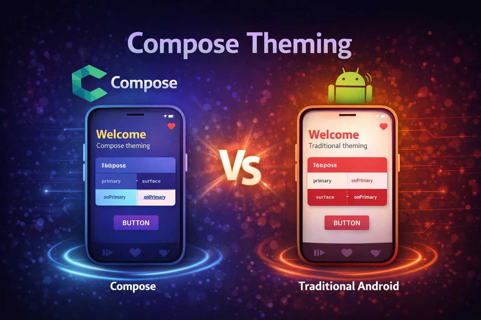
Theming in Compose is completely different from XML themes and styles. Instead of XML resources and ?attr/ references, you use Kotlin objects, CompositionLocal, and the MaterialTheme composable function. Your entire app’s visual identity — colors, typography, shapes — flows through the Composition tree and can be accessed from any composable. This guide covers Material3 theming, building a custom design system, Dynamic Color (Material You), dark mode, and extending the theme with your own tokens.
MaterialTheme — The Entry Point
MaterialTheme is a composable function from androidx.compose.material3 that provides colors, typography, and shapes to all composables inside it:
@Composable
fun MyApp() {
    MaterialTheme(
        // MaterialTheme is a COMPOSABLE FUNCTION from material3
        // It wraps CompositionLocalProvider internally to provide theme values
        colorScheme = LightColorScheme,
        // colorScheme is a PARAMETER of type ColorScheme
        // ColorScheme is a CLASS from material3 — holds all color tokens
        typography = AppTypography,
        // typography is a PARAMETER of type Typography
        // Typography is a CLASS from material3 — holds all text styles
        shapes = AppShapes
        // shapes is a PARAMETER of type Shapes
        // Shapes is a CLASS from material3 — holds corner shapes
    ) {
        // Everything inside inherits these theme values
        AppContent()
    }
}

// Access theme values ANYWHERE inside MaterialTheme:
@Composable
fun ArticleCard() {
    Card(
        colors = CardDefaults.cardColors(
            containerColor = MaterialTheme.colorScheme.surface
            // MaterialTheme is an OBJECT from material3
            // colorScheme is a PROPERTY that reads the current ColorScheme
            //   from the nearest MaterialTheme provider via CompositionLocal
            // surface is a PROPERTY on ColorScheme (a Color value)
        )
    ) {
        Text(
            text = "Title",
            style = MaterialTheme.typography.titleMedium,
            // typography is a PROPERTY on the MaterialTheme object
            // titleMedium is a PROPERTY on Typography (a TextStyle value)
            color = MaterialTheme.colorScheme.onSurface
            // onSurface is a PROPERTY on ColorScheme
        )
    }
}
Color Scheme
Material3 uses a color scheme with semantic color roles instead of arbitrary color names:
// ColorScheme is a CLASS with ~30 color properties
// Each color has a semantic meaning — not just "red" or "blue"

// Core color roles:
// primary           — main brand color (buttons, active states)
// onPrimary         — text/icons ON primary background
// primaryContainer  — lighter version for containers
// onPrimaryContainer— text/icons ON primaryContainer

// secondary         — accent color
// onSecondary       — text/icons ON secondary

// surface           — background for cards, sheets, dialogs
// onSurface         — text/icons ON surface
// surfaceVariant    — variant surface for differentiation
// onSurfaceVariant  — secondary text on surface

// background        — screen background
// onBackground      — text/icons ON background

// error             — error states
// onError           — text/icons ON error

// outline           — borders, dividers
// outlineVariant    — subtle borders
Defining your color scheme
// Define light and dark color schemes

private val LightColorScheme = lightColorScheme(
    // lightColorScheme() is a TOP-LEVEL FUNCTION from material3
    // Returns a ColorScheme with Material3 light defaults
    // Override specific colors — unspecified ones use Material3 defaults
    primary = Color(0xFF1976D2),
    // Color() is a CONSTRUCTOR — takes an ARGB hex value
    onPrimary = Color.White,
    // Color.White is a COMPANION OBJECT PROPERTY on Color
    primaryContainer = Color(0xFFBBDEFB),
    onPrimaryContainer = Color(0xFF001F3F),

    secondary = Color(0xFFFF6F00),
    onSecondary = Color.White,

    surface = Color(0xFFFFFBFE),
    onSurface = Color(0xFF1C1B1F),
    surfaceVariant = Color(0xFFE7E0EC),
    onSurfaceVariant = Color(0xFF49454F),

    background = Color(0xFFFFFBFE),
    onBackground = Color(0xFF1C1B1F),

    error = Color(0xFFB3261E),
    onError = Color.White,

    outline = Color(0xFF79747E),
    outlineVariant = Color(0xFFCAC4D0)
)

private val DarkColorScheme = darkColorScheme(
    // darkColorScheme() is a TOP-LEVEL FUNCTION from material3
    // Returns a ColorScheme with Material3 dark defaults
    primary = Color(0xFF90CAF9),
    onPrimary = Color(0xFF003258),
    primaryContainer = Color(0xFF00497D),
    onPrimaryContainer = Color(0xFFD1E4FF),

    secondary = Color(0xFFFFB74D),
    onSecondary = Color(0xFF4E2600),

    surface = Color(0xFF1C1B1F),
    onSurface = Color(0xFFE6E1E5),
    surfaceVariant = Color(0xFF49454F),
    onSurfaceVariant = Color(0xFFCAC4D0),

    background = Color(0xFF1C1B1F),
    onBackground = Color(0xFFE6E1E5),

    error = Color(0xFFF2B8B5),
    onError = Color(0xFF601410),

    outline = Color(0xFF938F99),
    outlineVariant = Color(0xFF49454F)
)
Using Material Theme Builder to generate colors
// Instead of manually picking 30 colors, use Google's Material Theme Builder:
// https://m3.material.io/theme-builder
//
// Steps:
// 1. Pick your PRIMARY color (brand color)
// 2. Tool generates the ENTIRE color scheme (light + dark)
// 3. Export as Kotlin (Jetpack Compose)
// 4. Drop the generated Color.kt and Theme.kt into your project
//
// The tool uses Material3's tonal palette algorithm:
// From one seed color → generates primary, secondary, tertiary,
// neutral, error colors with proper contrast ratios
Typography
// Typography is a CLASS from material3
// It defines text styles for different roles

// Material3 type scale:
// displayLarge, displayMedium, displaySmall     — hero text, large headers
// headlineLarge, headlineMedium, headlineSmall  — section headers
// titleLarge, titleMedium, titleSmall           — card titles, list items
// bodyLarge, bodyMedium, bodySmall              — paragraph text
// labelLarge, labelMedium, labelSmall           — buttons, tabs, captions

val AppTypography = Typography(
    // Typography() is a CONSTRUCTOR
    // Each parameter is a TextStyle — a CLASS from compose.ui.text

    displayLarge = TextStyle(
        fontFamily = FontFamily.Default,
        // FontFamily is a SEALED CLASS — Default, SansSerif, Serif, Monospace, Cursive
        fontWeight = FontWeight.Normal,
        // FontWeight is a CLASS — Normal, Bold, Thin, Light, Medium, SemiBold, etc.
        fontSize = 57.sp,
        // sp is an EXTENSION PROPERTY on Int — creates TextUnit in scaled pixels
        lineHeight = 64.sp,
        letterSpacing = (-0.25).sp
    ),

    headlineMedium = TextStyle(
        fontFamily = FontFamily.Default,
        fontWeight = FontWeight.SemiBold,
        fontSize = 28.sp,
        lineHeight = 36.sp
    ),

    titleMedium = TextStyle(
        fontFamily = FontFamily.Default,
        fontWeight = FontWeight.Medium,
        fontSize = 16.sp,
        lineHeight = 24.sp,
        letterSpacing = 0.15.sp
    ),

    bodyLarge = TextStyle(
        fontFamily = FontFamily.Default,
        fontWeight = FontWeight.Normal,
        fontSize = 16.sp,
        lineHeight = 24.sp,
        letterSpacing = 0.5.sp
    ),

    bodyMedium = TextStyle(
        fontFamily = FontFamily.Default,
        fontWeight = FontWeight.Normal,
        fontSize = 14.sp,
        lineHeight = 20.sp,
        letterSpacing = 0.25.sp
    ),

    labelLarge = TextStyle(
        fontFamily = FontFamily.Default,
        fontWeight = FontWeight.Medium,
        fontSize = 14.sp,
        lineHeight = 20.sp,
        letterSpacing = 0.1.sp
    )
)

// Using custom fonts:
val PoppinsFamily = FontFamily(
    // FontFamily() CONSTRUCTOR takes Font instances
    Font(R.font.poppins_regular, FontWeight.Normal),
    // Font() is a FUNCTION that loads a font resource
    Font(R.font.poppins_medium, FontWeight.Medium),
    Font(R.font.poppins_semibold, FontWeight.SemiBold),
    Font(R.font.poppins_bold, FontWeight.Bold)
)

// Then use it in Typography:
val AppTypography = Typography(
    bodyLarge = TextStyle(fontFamily = PoppinsFamily, fontSize = 16.sp),
    titleMedium = TextStyle(fontFamily = PoppinsFamily, fontWeight = FontWeight.SemiBold, fontSize = 16.sp)
    // ... other styles
)
Shapes
// Shapes is a CLASS from material3
// Defines corner rounding for different component sizes

val AppShapes = Shapes(
    // Shapes() is a CONSTRUCTOR with predefined size categories

    extraSmall = RoundedCornerShape(4.dp),
    // RoundedCornerShape() is a FUNCTION that returns a CornerBasedShape
    small = RoundedCornerShape(8.dp),
    medium = RoundedCornerShape(12.dp),
    large = RoundedCornerShape(16.dp),
    extraLarge = RoundedCornerShape(28.dp)
)

// Material3 components automatically use these shapes:
// Chips → extraSmall
// Buttons, TextFields → small
// Cards, Dialogs → medium
// Bottom Sheets → large
// FABs → large

// Using shapes in your composables:
Card(shape = MaterialTheme.shapes.medium) {
    // MaterialTheme.shapes is a PROPERTY that reads current Shapes
    // medium is a PROPERTY on Shapes
    Text("Rounded card")
}

// Custom shapes:
val CutCornerCard = CutCornerShape(topStart = 16.dp, bottomEnd = 16.dp)
// CutCornerShape() is a FUNCTION — angled corners instead of rounded

Card(shape = CutCornerCard) { Text("Angled corners") }
Putting It All Together — Your Theme
// Theme.kt — the central theme file for your app

@Composable
fun MyAppTheme(
    darkTheme: Boolean = isSystemInDarkTheme(),
    // isSystemInDarkTheme() is a COMPOSABLE FUNCTION from compose.foundation
    // Reads the system dark mode setting and returns Boolean
    dynamicColor: Boolean = true,
    content: @Composable () -> Unit
) {
    val colorScheme = when {
        dynamicColor && Build.VERSION.SDK_INT >= Build.VERSION_CODES.S -> {
            // Dynamic Color (Material You) — Android 12+
            val context = LocalContext.current
            if (darkTheme) dynamicDarkColorScheme(context)
            else dynamicLightColorScheme(context)
            // dynamicDarkColorScheme() is a TOP-LEVEL FUNCTION from material3
            // Reads the user's wallpaper colors and generates a scheme
        }
        darkTheme -> DarkColorScheme
        else -> LightColorScheme
    }

    MaterialTheme(
        colorScheme = colorScheme,
        typography = AppTypography,
        shapes = AppShapes,
        content = content
    )
}

// Usage in Activity:
class MainActivity : ComponentActivity() {
    override fun onCreate(savedInstanceState: Bundle?) {
        super.onCreate(savedInstanceState)
        setContent {
            MyAppTheme {
                AppContent()
            }
        }
    }
}

// Usage in @Preview:
@Preview
@Composable
fun PreviewLight() {
    MyAppTheme(darkTheme = false) { ArticleCard(sampleArticle) }
}

@Preview
@Composable
fun PreviewDark() {
    MyAppTheme(darkTheme = true) { ArticleCard(sampleArticle) }
}
Dynamic Color — Material You
// Dynamic Color extracts colors from the user's WALLPAPER
// Available on Android 12+ (API 31+)
// Your app automatically matches the user's personal theme

// dynamicLightColorScheme(context) → ColorScheme from wallpaper (light)
// dynamicDarkColorScheme(context) → ColorScheme from wallpaper (dark)
// Both are TOP-LEVEL FUNCTIONS from material3

val colorScheme = when {
    // Check: Android 12+ AND user/developer wants dynamic color
    dynamicColor && Build.VERSION.SDK_INT >= Build.VERSION_CODES.S -> {
        val context = LocalContext.current
        if (darkTheme) dynamicDarkColorScheme(context)
        else dynamicLightColorScheme(context)
    }
    // Fallback to your custom color scheme on older Android
    darkTheme -> DarkColorScheme
    else -> LightColorScheme
}

// When to use Dynamic Color:
// ✅ Most apps — makes your app feel native and personal
// ❌ Apps with strong brand identity (Instagram, Spotify)
//    where you NEED your specific brand colors

// You can still use your brand colors for specific elements:
// MaterialTheme for general UI + hardcoded brand color for logo/accent
val brandColor = Color(0xFF1DB954)   // Spotify green — always this, not dynamic
Dark Mode
// Dark mode works automatically when you provide both light and dark color schemes
// MaterialTheme + isSystemInDarkTheme() handles the switching

@Composable
fun MyAppTheme(
    darkTheme: Boolean = isSystemInDarkTheme(),
    content: @Composable () -> Unit
) {
    val colorScheme = if (darkTheme) DarkColorScheme else LightColorScheme
    MaterialTheme(colorScheme = colorScheme, content = content)
}

// All composables that use MaterialTheme.colorScheme automatically adapt:
Text(color = MaterialTheme.colorScheme.onSurface)
// Light mode: dark text on light background
// Dark mode: light text on dark background — automatic!

// Manual dark mode toggle (user preference):
@Composable
fun AppWithDarkModeToggle() {
    var isDark by rememberSaveable { mutableStateOf(false) }

    MyAppTheme(darkTheme = isDark) {
        Scaffold {
            Switch(
                checked = isDark,
                onCheckedChange = { isDark = it }
                // Toggle between light and dark — entire app updates
            )
        }
    }
}

// Persist user preference:
// Save to DataStore, read in ViewModel, pass to theme
@Composable
fun App(viewModel: SettingsViewModel = hiltViewModel()) {
    val themeMode by viewModel.themeMode.collectAsStateWithLifecycle()
    // themeMode could be: System, Light, Dark

    val isDark = when (themeMode) {
        ThemeMode.System -> isSystemInDarkTheme()
        ThemeMode.Light -> false
        ThemeMode.Dark -> true
    }

    MyAppTheme(darkTheme = isDark) { AppContent() }
}
Extending the Theme — Custom Design Tokens
Material3’s color scheme might not cover everything your app needs. You can add custom tokens using CompositionLocal:
// Step 1: Define your custom color tokens
@Immutable
// @Immutable is an ANNOTATION from compose.runtime
// Tells Compose this class never changes — enables skipping
data class ExtendedColors(
    val success: Color,
    val onSuccess: Color,
    val warning: Color,
    val onWarning: Color,
    val highlight: Color,
    val gradientStart: Color,
    val gradientEnd: Color
)

// Step 2: Create a CompositionLocal for your custom colors
val LocalExtendedColors = staticCompositionLocalOf {
    // staticCompositionLocalOf is a TOP-LEVEL FUNCTION
    // The lambda provides a default value
    ExtendedColors(
        success = Color.Unspecified,
        onSuccess = Color.Unspecified,
        warning = Color.Unspecified,
        onWarning = Color.Unspecified,
        highlight = Color.Unspecified,
        gradientStart = Color.Unspecified,
        gradientEnd = Color.Unspecified
    )
}

// Step 3: Define light and dark variants
val LightExtendedColors = ExtendedColors(
    success = Color(0xFF2E7D32),
    onSuccess = Color.White,
    warning = Color(0xFFF57F17),
    onWarning = Color.Black,
    highlight = Color(0xFFFFF9C4),
    gradientStart = Color(0xFF1976D2),
    gradientEnd = Color(0xFF42A5F5)
)

val DarkExtendedColors = ExtendedColors(
    success = Color(0xFF81C784),
    onSuccess = Color(0xFF003300),
    warning = Color(0xFFFFD54F),
    onWarning = Color(0xFF3E2700),
    highlight = Color(0xFF3E3A00),
    gradientStart = Color(0xFF0D47A1),
    gradientEnd = Color(0xFF1565C0)
)

// Step 4: Provide in your theme
@Composable
fun MyAppTheme(
    darkTheme: Boolean = isSystemInDarkTheme(),
    content: @Composable () -> Unit
) {
    val colorScheme = if (darkTheme) DarkColorScheme else LightColorScheme
    val extendedColors = if (darkTheme) DarkExtendedColors else LightExtendedColors

    CompositionLocalProvider(
        // CompositionLocalProvider is a COMPOSABLE FUNCTION
        LocalExtendedColors provides extendedColors
        // "provides" is an INFIX FUNCTION on ProvidableCompositionLocal
    ) {
        MaterialTheme(
            colorScheme = colorScheme,
            typography = AppTypography,
            shapes = AppShapes,
            content = content
        )
    }
}

// Step 5: Create a convenient accessor
object ExtendedTheme {
    val colors: ExtendedColors
        @Composable
        get() = LocalExtendedColors.current
        // .current is a PROPERTY that reads from the nearest provider
}

// Step 6: Use anywhere in your app
@Composable
fun SuccessBanner(message: String) {
    Surface(
        color = ExtendedTheme.colors.success,
        contentColor = ExtendedTheme.colors.onSuccess,
        shape = MaterialTheme.shapes.medium
    ) {
        Text(
            text = message,
            modifier = Modifier.padding(16.dp),
            style = MaterialTheme.typography.bodyMedium
        )
    }
}

// The pattern works for custom typography and spacing too:
@Immutable
data class ExtendedSpacing(
    val xs: Dp = 4.dp,
    val sm: Dp = 8.dp,
    val md: Dp = 16.dp,
    val lg: Dp = 24.dp,
    val xl: Dp = 32.dp
)

val LocalExtendedSpacing = staticCompositionLocalOf { ExtendedSpacing() }

object AppTheme {
    val colors: ExtendedColors @Composable get() = LocalExtendedColors.current
    val spacing: ExtendedSpacing @Composable get() = LocalExtendedSpacing.current
}

// Usage:
Modifier.padding(AppTheme.spacing.md)   // 16.dp from your design system
Common Mistakes to Avoid
Mistake 1: Hardcoding colors instead of using theme
// ❌ Hardcoded — doesn't adapt to dark mode, Dynamic Color, or theme changes
Text(text = "Title", color = Color(0xFF000000))
Card(colors = CardDefaults.cardColors(containerColor = Color.White))

// ✅ Use theme tokens — automatically adapts everywhere
Text(text = "Title", color = MaterialTheme.colorScheme.onSurface)
Card(colors = CardDefaults.cardColors(containerColor = MaterialTheme.colorScheme.surface))
Mistake 2: Forgetting to wrap in MaterialTheme
// ❌ No theme wrapper — components use default fallback colors (ugly)
setContent {
    ArticleScreen()   // MaterialTheme.colorScheme returns defaults — wrong colors!
}

// ✅ Always wrap in your theme
setContent {
    MyAppTheme {
        ArticleScreen()   // correctly themed
    }
}
Mistake 3: Using Material3 function names from Material2
// ❌ Material2 API — doesn't exist in Material3
MaterialTheme.colors.primary        // Material2 — "colors"
MaterialTheme.colors.surface

// ✅ Material3 API — use "colorScheme"
MaterialTheme.colorScheme.primary   // Material3 — "colorScheme"
MaterialTheme.colorScheme.surface
Mistake 4: Not providing dark colors
// ❌ Only light scheme — dark mode looks terrible or crashes
@Composable
fun MyAppTheme(content: @Composable () -> Unit) {
    MaterialTheme(colorScheme = LightColorScheme, content = content)
    // Dark mode: white text on white background — unreadable!
}

// ✅ Provide both light and dark
@Composable
fun MyAppTheme(
    darkTheme: Boolean = isSystemInDarkTheme(),
    content: @Composable () -> Unit
) {
    val colorScheme = if (darkTheme) DarkColorScheme else LightColorScheme
    MaterialTheme(colorScheme = colorScheme, content = content)
}
Mistake 5: Creating custom colors that clash with Material roles
// ❌ Naming a custom color "primary" — conflicts with Material's primary
val LocalPrimary = staticCompositionLocalOf { Color.Blue }
// Confusing — is this Material primary or your custom primary?

// ✅ Use distinct names for custom tokens
val LocalBrandColor = staticCompositionLocalOf { Color.Blue }
val LocalSuccessColor = staticCompositionLocalOf { Color.Green }
// Clear distinction from Material3 color roles
Summary
MaterialTheme(composable function) provides colors, typography, and shapes to all composables inside itMaterialTheme.colorScheme,.typography,.shapesare properties on the MaterialTheme object — read current theme values via CompositionLocalColorScheme(class) has ~30 semantic color roles: primary, onPrimary, surface, onSurface, error, etc.lightColorScheme()anddarkColorScheme()are top-level functions that create ColorScheme with Material3 defaultsTypography(class) defines text styles for display, headline, title, body, and label rolesShapes(class) defines corner rounding for extraSmall, small, medium, large, extraLarge sizes- Material Theme Builder (web tool) generates a complete color scheme from one seed color
- Dynamic Color (Material You) uses
dynamicLightColorScheme()/dynamicDarkColorScheme()(top-level functions) — Android 12+ isSystemInDarkTheme()is a composable function that reads the system dark mode setting- Always provide both light and dark color schemes — dark mode is expected on modern Android
- Extend the theme with custom tokens using
@Immutabledata classes +staticCompositionLocalOf+CompositionLocalProvider - Use semantic theme tokens (
MaterialTheme.colorScheme.onSurface) instead of hardcoded colors — adapts to dark mode and Dynamic Color automatically - Use
FontFamily()constructor withFont()function to load custom fonts from resources
Theming in Compose is more powerful and more type-safe than XML theming. Your entire design system lives in Kotlin — colors, typography, shapes, and custom tokens — flowing through the Composition tree via CompositionLocal. Define your theme once, wrap your app in it, and every composable automatically gets the right colors in light mode, dark mode, and Dynamic Color — without a single hardcoded color value.
Happy coding!


Comments (0)