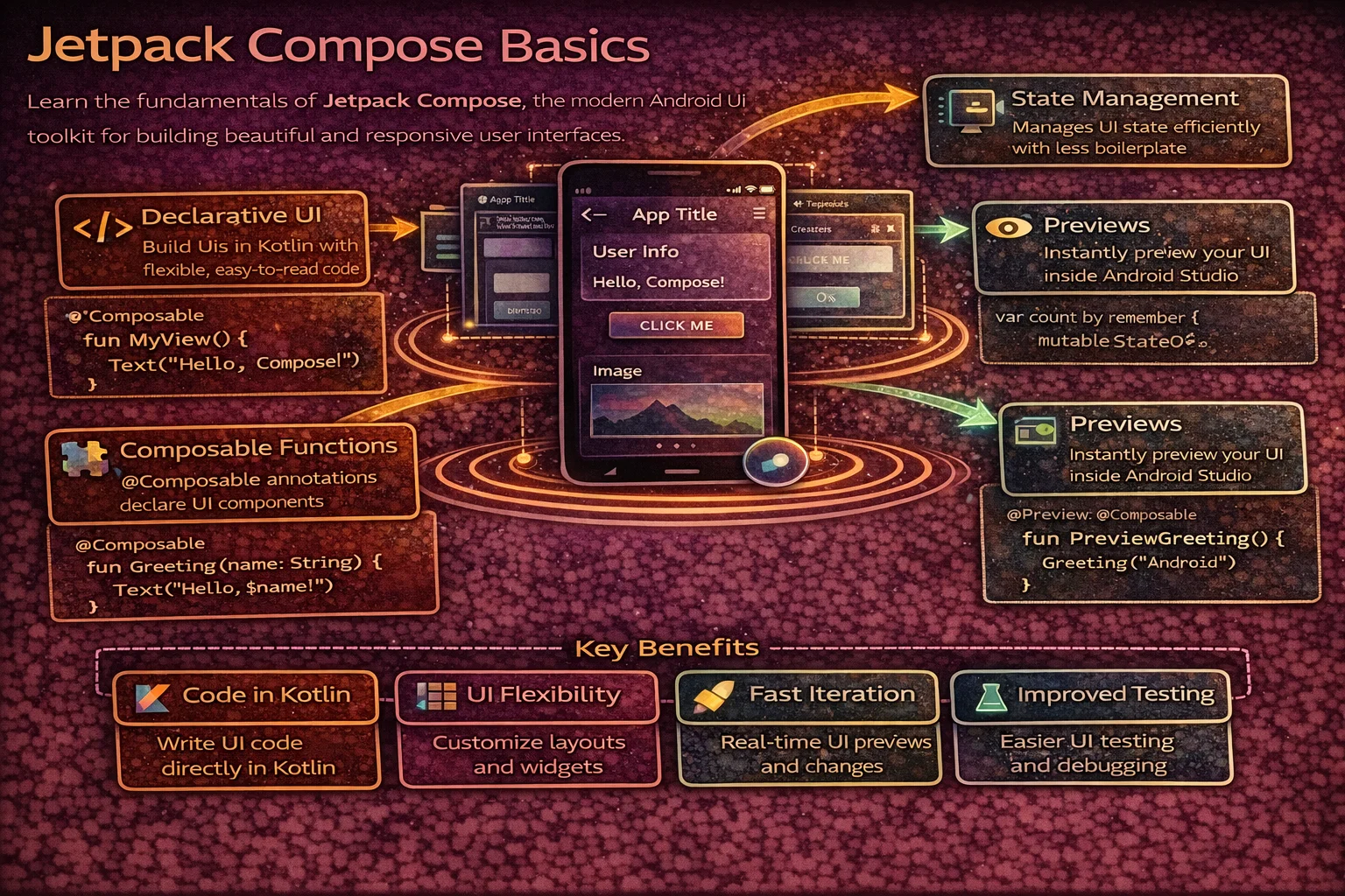
Jetpack Compose is Android’s modern, declarative UI toolkit. Instead of writing XML layouts and manipulating Views imperatively, you describe what your UI should look like and Compose handles the how. It’s built entirely in Kotlin, uses functions instead of classes for UI components, and automatically updates the screen when your data changes. This guide covers the fundamentals — composable functions, state, recomposition — with precise identification of every concept so there’s zero confusion about what each thing actually is.
What is Jetpack Compose?
// Traditional Android UI (imperative):
// 1. Define UI in XML layout files
// 2. Inflate XML in Activity/Fragment
// 3. Find Views with ViewBinding
// 4. Mutate Views in response to data changes
//    binding.titleText.text = article.title
//    binding.loadingSpinner.isVisible = isLoading
//    binding.errorView.isVisible = hasError
// Problem: you manage UI STATE yourself — easy to get out of sync

// Jetpack Compose (declarative):
// 1. Describe what UI should look like as a FUNCTION of state
// 2. When state changes, Compose AUTOMATICALLY re-renders
// 3. No XML, no ViewBinding, no manual View mutations

@Composable   // ← annotation that marks this as a composable function
fun ArticleScreen(article: Article, isLoading: Boolean) {
    if (isLoading) {
        CircularProgressIndicator()   // show loading
    } else {
        Text(text = article.title)    // show content
    }
    // When isLoading changes from true to false,
    // Compose automatically removes the spinner and shows the text
    // You never call "remove spinner" or "show text" — just describe the state
}
Setup
// build.gradle.kts
plugins {
    alias(libs.plugins.kotlin.compose)   // Kotlin Compose compiler plugin
}

android {
    buildFeatures {
        compose = true
    }
}

dependencies {
    // BOM (Bill of Materials) — manages all Compose library versions
    // platform() is a Gradle function that imports a BOM
    implementation(platform("androidx.compose:compose-bom:2024.10.00"))

    // Core Compose libraries (versions managed by BOM — no version needed)
    implementation("androidx.compose.ui:ui")
    implementation("androidx.compose.material3:material3")
    implementation("androidx.compose.ui:ui-tooling-preview")
    debugImplementation("androidx.compose.ui:ui-tooling")

    // Activity integration
    // ComponentActivity is a CLASS from this library
    implementation("androidx.activity:activity-compose:1.9.2")

    // ViewModel integration
    // hiltViewModel() is a COMPOSABLE FUNCTION from this library
    implementation("androidx.hilt:hilt-navigation-compose:1.2.0")

    // Lifecycle-aware state collection
    // collectAsStateWithLifecycle() is an EXTENSION FUNCTION on Flow/StateFlow
    implementation("androidx.lifecycle:lifecycle-runtime-compose:2.8.6")
}
Composable Functions — The Building Block
In Compose, UI components are functions, not classes. A composable function describes a piece of UI:
// @Composable is an ANNOTATION that marks a function as a composable
// The Compose compiler plugin transforms this function to track state and recomposition
// It's NOT a regular annotation — it changes how the function is compiled

@Composable
fun Greeting(name: String) {    // a composable function — note: PascalCase naming
    Text(text = "Hello, $name!")
    // Text() is a COMPOSABLE FUNCTION from Material3 — not a class
    // It emits a text element into the composition
}

// Composable functions:
// - Are annotated with @Composable
// - Use PascalCase naming (like classes, not like regular functions)
// - Can only be called from other @Composable functions
// - Don't return a View — they EMIT UI into the composition tree
// - Can be called multiple times (recomposition)
// - Should be FAST, IDEMPOTENT, and SIDE-EFFECT FREE
Your first Compose screen
// ComponentActivity is a CLASS — the base Activity for Compose
// setContent {} is an EXTENSION FUNCTION on ComponentActivity
// It sets the Compose UI as the Activity's content (replaces setContentView)

class MainActivity : ComponentActivity() {
    override fun onCreate(savedInstanceState: Bundle?) {
        super.onCreate(savedInstanceState)

        setContent {
            // MaterialTheme is a COMPOSABLE FUNCTION that provides theming
            // Everything inside it inherits Material3 colors, typography, shapes
            MaterialTheme {
                // Surface is a COMPOSABLE FUNCTION — a container with background color
                Surface(
                    modifier = Modifier.fillMaxSize(),   // Modifier is a CLASS (more later)
                    color = MaterialTheme.colorScheme.background
                    // MaterialTheme is an OBJECT that provides access to the current theme
                    // colorScheme is a PROPERTY on that object
                ) {
                    Greeting(name = "Android")
                }
            }
        }
    }
}

@Composable
fun Greeting(name: String) {
    Text(
        text = "Hello, $name!",
        style = MaterialTheme.typography.headlineMedium,
        // typography is a PROPERTY on MaterialTheme object
        // headlineMedium is a PROPERTY on Typography class
        color = MaterialTheme.colorScheme.onBackground
    )
}
Composable function rules
// ✅ Composable calling composable — works
@Composable
fun ArticleCard(article: Article) {
    Text(text = article.title)     // composable calling composable ✅
    ArticleImage(article.imageUrl) // composable calling composable ✅
}

// ❌ Regular function calling composable — compile error
fun formatAndShow(text: String) {
    Text(text = text)   // ❌ @Composable invocations can only happen
                         //    from the context of a @Composable function
}

// ✅ Composable calling regular function — works
@Composable
fun ArticleCard(article: Article) {
    val formatted = formatDate(article.date)   // regular function ✅
    Text(text = formatted)
}

// Naming convention:
// Composable functions that EMIT UI → PascalCase (like classes)
//   @Composable fun ArticleCard()
//   @Composable fun UserAvatar()
//
// Composable functions that RETURN a value → camelCase (like functions)
//   @Composable fun rememberScrollState(): ScrollState
//   @Composable fun collectAsStateWithLifecycle(): State<T>
Built-in Composable Functions
Text
// Text() is a COMPOSABLE FUNCTION — not a View class, not a widget
// It's defined in androidx.compose.material3

@Composable
fun TextExamples() {
    // Basic text
    Text(text = "Hello, Compose!")

    // Styled text
    Text(
        text = "Styled text",
        fontSize = 20.sp,
        // sp is an EXTENSION PROPERTY on Int/Float (from compose.ui.unit)
        // It creates a TextUnit in scaled pixels
        fontWeight = FontWeight.Bold,
        // FontWeight is a CLASS, Bold is a COMPANION OBJECT constant
        color = MaterialTheme.colorScheme.primary,
        maxLines = 2,
        overflow = TextOverflow.Ellipsis
        // TextOverflow is a CLASS with predefined instances (Clip, Ellipsis, Visible)
    )

    // With string resources
    Text(text = stringResource(R.string.welcome_message))
    // stringResource() is a COMPOSABLE FUNCTION that reads from res/values/strings.xml

    // Formatted string resource
    Text(text = stringResource(R.string.greeting, "Alice", 5))
    // "Hello, %1$s! You have %2$d messages."
}
Button
// Button() is a COMPOSABLE FUNCTION — takes onClick lambda and content composable

@Composable
fun ButtonExamples() {
    // Filled button (default)
    Button(
        onClick = { /* handle click */ },
        // onClick is a regular lambda parameter: () -> Unit
    ) {
        // Content is a COMPOSABLE LAMBDA — @Composable RowScope.() -> Unit
        // RowScope is an INTERFACE that provides Row-specific modifiers
        Text("Submit")   // button label
    }

    // Outlined button
    OutlinedButton(onClick = { }) {
        Text("Cancel")
    }

    // Text button (no background)
    TextButton(onClick = { }) {
        Text("Learn more")
    }

    // Button with icon
    Button(onClick = { }) {
        Icon(
            imageVector = Icons.Default.Add,
            // Icons is an OBJECT, Default is a nested OBJECT
            // Add is an EXTENSION PROPERTY on Icons.Default that returns an ImageVector
            contentDescription = "Add"
        )
        Spacer(modifier = Modifier.width(8.dp))
        // Spacer() is a COMPOSABLE FUNCTION — empty space
        // dp is an EXTENSION PROPERTY on Int/Float (from compose.ui.unit)
        Text("Add item")
    }
}
Image
@Composable
fun ImageExamples() {
    // Resource image
    Image(
        painter = painterResource(R.drawable.photo),
        // painterResource() is a COMPOSABLE FUNCTION that loads a drawable resource
        // It returns a Painter ABSTRACT CLASS instance
        contentDescription = "Article photo",
        // contentDescription is for accessibility (TalkBack)
        contentScale = ContentScale.Crop
        // ContentScale is a CLASS with predefined instances (Crop, Fit, FillBounds, etc.)
    )

    // Network image with Coil
    AsyncImage(
        model = "https://example.com/photo.jpg",
        // AsyncImage is a COMPOSABLE FUNCTION from the Coil-Compose library
        contentDescription = "Photo",
        contentScale = ContentScale.Crop,
        placeholder = painterResource(R.drawable.placeholder),
        error = painterResource(R.drawable.error_image)
    )
}

// Add Coil dependency:
// implementation("io.coil-kt:coil-compose:2.7.0")
TextField
@Composable
fun TextFieldExample() {
    // remember is a COMPOSABLE FUNCTION that stores a value across recompositions
    // mutableStateOf() is a TOP-LEVEL FUNCTION that creates an observable MutableState<T>
    var text by remember { mutableStateOf("") }
    // "by" is Kotlin's PROPERTY DELEGATION — delegates get/set to the State object
    // This lets you write "text" instead of "text.value"

    // OutlinedTextField is a COMPOSABLE FUNCTION — Material3 text input
    OutlinedTextField(
        value = text,
        onValueChange = { newText -> text = newText },
        // onValueChange is a lambda: (String) -> Unit
        // Called on every keystroke — you update your state, Compose re-renders
        label = { Text("Email") },
        // label is a COMPOSABLE LAMBDA — @Composable () -> Unit
        placeholder = { Text("Enter your email") },
        singleLine = true,
        keyboardOptions = KeyboardOptions(
            // KeyboardOptions is a DATA CLASS for configuring the keyboard
            keyboardType = KeyboardType.Email,
            // KeyboardType is a CLASS with predefined instances
            imeAction = ImeAction.Next
            // ImeAction is a CLASS — Next, Done, Search, Go, etc.
        )
    )
}
Modifier — Configuring Composables
Modifier is a companion object that serves as the entry point for a chain of configuration functions. Each function returns a new Modifier (they’re immutable — chained, not mutated):
// Modifier is a COMPANION OBJECT on the Modifier INTERFACE
// It implements Modifier and serves as the starting point for chains
// Each function on Modifier is an EXTENSION FUNCTION that returns a new Modifier

@Composable
fun ModifierExample() {
    Text(
        text = "Hello",
        modifier = Modifier
            .fillMaxWidth()
            // fillMaxWidth() is an EXTENSION FUNCTION on Modifier
            // Returns a new Modifier that makes the composable fill parent width
            .padding(16.dp)
            // padding() is an EXTENSION FUNCTION on Modifier
            // dp is an EXTENSION PROPERTY on Int that creates a Dp value
            .background(
                color = MaterialTheme.colorScheme.surface,
                shape = RoundedCornerShape(8.dp)
                // RoundedCornerShape() is a FUNCTION that returns a Shape
            )
            .clickable { /* handle click */ }
            // clickable() is an EXTENSION FUNCTION on Modifier
            // Adds click handling with ripple effect
            .border(
                width = 1.dp,
                color = MaterialTheme.colorScheme.outline,
                shape = RoundedCornerShape(8.dp)
            )
    )
}

// ⚠️ MODIFIER ORDER MATTERS — each modifier wraps the previous one
// padding THEN background ≠ background THEN padding

@Composable
fun ModifierOrderMatters() {
    // Padding OUTSIDE background — padding is transparent
    Text(
        text = "A",
        modifier = Modifier
            .padding(16.dp)         // 1st: add 16dp transparent space
            .background(Color.Red)  // 2nd: red background INSIDE the padding
    )

    // Padding INSIDE background — padding is red
    Text(
        text = "B",
        modifier = Modifier
            .background(Color.Red)  // 1st: red background on full area
            .padding(16.dp)         // 2nd: 16dp padding inside the red area
    )
}
Common Modifiers
// Size modifiers (all EXTENSION FUNCTIONS on Modifier)
Modifier.fillMaxSize()              // fill parent width AND height
Modifier.fillMaxWidth()             // fill parent width
Modifier.fillMaxHeight()            // fill parent height
Modifier.width(200.dp)              // exact width
Modifier.height(100.dp)             // exact height
Modifier.size(48.dp)                // exact width AND height (square)
Modifier.wrapContentSize()          // shrink to content

// Spacing
Modifier.padding(16.dp)             // all sides
Modifier.padding(horizontal = 16.dp, vertical = 8.dp)
Modifier.padding(start = 16.dp, top = 8.dp, end = 16.dp, bottom = 8.dp)

// Appearance
Modifier.background(Color.Red)
Modifier.background(Color.Red, RoundedCornerShape(8.dp))
Modifier.border(1.dp, Color.Gray, RoundedCornerShape(8.dp))
Modifier.clip(RoundedCornerShape(8.dp))      // clip content to shape
Modifier.clip(CircleShape)                    // circular clip
// CircleShape is a VAL (object) defined in compose.foundation.shape
Modifier.alpha(0.5f)                          // transparency
Modifier.shadow(4.dp, RoundedCornerShape(8.dp))

// Interaction
Modifier.clickable { /* handle click */ }
Modifier.combinedClickable(
    onClick = { /* single tap */ },
    onLongClick = { /* long press */ }
)
Modifier.scrollable(rememberScrollState(), Orientation.Vertical)

// Layout
Modifier.weight(1f)                 // in Row/Column — proportional sizing
// weight() is an EXTENSION FUNCTION on Modifier available in RowScope/ColumnScope
Modifier.align(Alignment.CenterHorizontally)   // in Column
Modifier.align(Alignment.Center)                // in Box
State — Making UI Reactive
State is the core concept in Compose. When state changes, Compose automatically re-renders the parts of the UI that use that state:
@Composable
fun Counter() {
    // remember is a COMPOSABLE FUNCTION — stores a value across recompositions
    // Without remember, the value resets to 0 on every recomposition

    // mutableStateOf() is a TOP-LEVEL FUNCTION from compose.runtime
    // It creates a MutableState<T> — an OBSERVABLE value holder
    // When you write to it, Compose knows to re-render

    // mutableIntStateOf() is an OPTIMISED VARIANT for Int (avoids boxing)
    var count by remember { mutableIntStateOf(0) }
    // "by" is Kotlin PROPERTY DELEGATION
    // Reads/writes go through State.getValue/setValue extension operators

    Column(
        // Column is a COMPOSABLE FUNCTION that arranges children vertically
        horizontalAlignment = Alignment.CenterHorizontally,
        // Alignment is a CLASS with predefined alignment values
        modifier = Modifier.padding(16.dp)
    ) {
        Text(
            text = "Count: $count",
            style = MaterialTheme.typography.headlineMedium
        )

        Spacer(modifier = Modifier.height(8.dp))

        Button(onClick = { count++ }) {
            // When count changes (count++), Compose RECOMPOSES this Counter function
            // Only the parts that READ count are re-rendered
            Text("Increment")
        }
    }
}
remember vs rememberSaveable
// remember — survives RECOMPOSITION only
// Value is lost on: configuration change, process death, navigation
var count by remember { mutableIntStateOf(0) }
// User rotates screen → count resets to 0!

// rememberSaveable — survives recomposition AND configuration changes
// Uses the saved instance state mechanism (like onSaveInstanceState)
var count by rememberSaveable { mutableIntStateOf(0) }
// User rotates screen → count is preserved!

// rememberSaveable is a COMPOSABLE FUNCTION from compose.runtime.saveable
// It automatically saves and restores values that are:
// - Primitives (Int, String, Boolean, Float, Long)
// - Parcelable objects
// - Lists/Maps of the above

// For custom objects, provide a Saver:
// rememberSaveable(saver = MyCustomSaver) { mutableStateOf(myObject) }

// When to use which:
// remember          → derived values, UI-only state that can be recalculated
// rememberSaveable  → user input, scroll position, selected tab
State Hoisting — separating state from UI
// STATE HOISTING moves state UP to the caller and passes it DOWN as parameters
// This makes composables reusable, testable, and previewable

// ❌ Stateful composable — manages its own state, hard to control from outside
@Composable
fun CounterStateful() {
    var count by remember { mutableIntStateOf(0) }
    Text("Count: $count")
    Button(onClick = { count++ }) { Text("Increment") }
}

// ✅ Stateless composable — receives state and events from caller
@Composable
fun CounterStateless(
    count: Int,                  // state flows DOWN
    onIncrement: () -> Unit      // events flow UP
) {
    Text("Count: $count")
    Button(onClick = onIncrement) { Text("Increment") }
}

// Caller manages the state
@Composable
fun CounterScreen() {
    var count by remember { mutableIntStateOf(0) }
    CounterStateless(
        count = count,
        onIncrement = { count++ }
    )
}

// The pattern:
// State flows DOWN (parameters)
// Events flow UP (callback lambdas)
// This is called UNIDIRECTIONAL DATA FLOW

// Benefits:
// - CounterStateless can be reused with any state source
// - CounterStateless can be tested without running Compose
// - CounterStateless can be previewed with fixed values
// - Single source of truth for the state
Recomposition — How Compose Updates the UI
// Recomposition is the process of calling composable functions AGAIN
// when the state they read changes

@Composable
fun RecompositionExample() {
    var name by remember { mutableStateOf("") }
    var count by remember { mutableIntStateOf(0) }

    Column {
        // This TextField recomposes when "name" changes
        OutlinedTextField(
            value = name,
            onValueChange = { name = it },
            label = { Text("Name") }
        )

        // This Text recomposes when "name" changes
        Text("Hello, $name")

        // This Text recomposes when "count" changes
        // It does NOT recompose when "name" changes (doesn't read name)
        Text("Count: $count")

        Button(onClick = { count++ }) {
            Text("Increment")
        }
    }

    // Compose tracks which composable reads which state
    // When count changes → only "Count: $count" and Button recompose
    // When name changes → only TextField and "Hello, $name" recompose
    // This is called SMART RECOMPOSITION — Compose skips unchanged parts
}
Recomposition rules
// 1. Recomposition is triggered by STATE changes
//    Only MutableState, StateFlow (with collectAsState), and other
//    observable state types trigger recomposition

// 2. Compose SKIPS composables whose inputs haven't changed
//    If a composable receives the same parameters, it's NOT re-called
//    This is why stable types (data class, primitives) are important

// 3. Recomposition can happen in ANY ORDER
//    Don't rely on composable functions being called in a specific order

// 4. Recomposition can be CANCELLED and RESTARTED
//    If state changes while recomposition is in progress, Compose may
//    cancel and restart with the new state

// 5. Composable functions may run FREQUENTLY
//    ❌ Don't do heavy work inside composable functions
//    ❌ Don't make network calls inside composable functions
//    ❌ Don't write to databases inside composable functions
//    ✅ Use side effects (LaunchedEffect) for these operations

// 6. Composable functions should be IDEMPOTENT
//    Calling them multiple times with the same input should produce
//    the same result — no hidden side effects
Observing ViewModel State in Compose
// The standard pattern: ViewModel exposes StateFlow, Compose collects it

@HiltViewModel   // ANNOTATION — marks this ViewModel for Hilt injection
class ArticleViewModel @Inject constructor(
    private val repository: ArticleRepository
) : ViewModel() {
    // ViewModel is an ABSTRACT CLASS from androidx.lifecycle

    private val _uiState = MutableStateFlow<UiState>(UiState.Loading)
    // MutableStateFlow is a CLASS that holds observable state
    val uiState: StateFlow<UiState> = _uiState
    // StateFlow is an INTERFACE — read-only version of MutableStateFlow

    fun loadArticles() {
        viewModelScope.launch {
            // viewModelScope is an EXTENSION PROPERTY on ViewModel
            // launch is an EXTENSION FUNCTION on CoroutineScope (coroutine builder)
            try {
                val articles = repository.getArticles()
                _uiState.value = UiState.Success(articles)
            } catch (e: CancellationException) {
                throw e
            } catch (e: Exception) {
                _uiState.value = UiState.Error(e.message ?: "Unknown error")
            }
        }
    }
}

sealed interface UiState {
    // sealed interface — restricted hierarchy, compiler knows all subtypes
    data object Loading : UiState
    data class Success(val articles: List<Article>) : UiState
    data class Error(val message: String) : UiState
}

@Composable
fun ArticleScreen(
    viewModel: ArticleViewModel = hiltViewModel()
    // hiltViewModel() is a COMPOSABLE FUNCTION from hilt-navigation-compose
    // It creates or retrieves a ViewModel with Hilt-injected dependencies
) {
    val uiState by viewModel.uiState.collectAsStateWithLifecycle()
    // collectAsStateWithLifecycle() is an EXTENSION FUNCTION on StateFlow
    // from lifecycle-runtime-compose
    // It collects the Flow into a Compose State<T>
    // AND respects lifecycle (stops collecting when not visible)
    // Returns State<T> — "by" delegates read access

    when (val state = uiState) {
        is UiState.Loading -> {
            // CircularProgressIndicator is a COMPOSABLE FUNCTION
            CircularProgressIndicator(
                modifier = Modifier.fillMaxSize().wrapContentSize()
            )
        }
        is UiState.Success -> {
            ArticleList(
                articles = state.articles,
                onArticleClick = { /* navigate */ }
            )
        }
        is UiState.Error -> {
            ErrorMessage(
                message = state.message,
                onRetry = { viewModel.loadArticles() }
            )
        }
    }
}

@Composable
fun ArticleList(
    articles: List<Article>,     // state flows DOWN
    onArticleClick: (Article) -> Unit   // events flow UP
) {
    LazyColumn {
        // LazyColumn is a COMPOSABLE FUNCTION — scrollable vertical list (like RecyclerView)
        // items() is an EXTENSION FUNCTION on LazyListScope
        items(
            items = articles,
            key = { article -> article.id }   // stable keys for efficient recomposition
        ) { article ->
            ArticleCard(
                article = article,
                onClick = { onArticleClick(article) }
            )
        }
    }
}

@Composable
fun ErrorMessage(message: String, onRetry: () -> Unit) {
    Column(
        modifier = Modifier.fillMaxSize().padding(16.dp),
        horizontalAlignment = Alignment.CenterHorizontally,
        verticalArrangement = Arrangement.Center
        // Arrangement is a CLASS with predefined spacing strategies
        // Center is a property that centers children
    ) {
        Text(text = message, color = MaterialTheme.colorScheme.error)
        Spacer(modifier = Modifier.height(8.dp))
        Button(onClick = onRetry) { Text("Retry") }
    }
}
Preview — See UI Without Running the App
// @Preview is an ANNOTATION from compose.ui.tooling.preview
// It renders the composable in Android Studio's preview pane

@Preview(showBackground = true)   // show with white background
@Composable
fun GreetingPreview() {
    MaterialTheme {
        Greeting(name = "Android")
    }
}

// Preview with parameters
@Preview(
    name = "Dark Mode",
    showBackground = true,
    uiMode = Configuration.UI_MODE_NIGHT_YES   // dark theme
)
@Preview(
    name = "Light Mode",
    showBackground = true,
    uiMode = Configuration.UI_MODE_NIGHT_NO    // light theme
)
@Composable
fun ArticleCardPreview() {
    MaterialTheme {
        ArticleCard(
            article = Article(
                id = "1",
                title = "Kotlin Coroutines Deep Dive",
                author = "Alice",
                imageUrl = ""
            ),
            onClick = {}
        )
    }
}

// Previews work best with STATELESS composables (state hoisting!)
// You provide fixed data → preview renders instantly
// This is another reason to hoist state out of composables
Compose vs XML — Key Differences
// ┌──────────────────────────┬────────────────────────┬────────────────────────┐
// │ Concept                  │ XML Views              │ Jetpack Compose        │
// ├──────────────────────────┼────────────────────────┼────────────────────────┤
// │ UI definition            │ XML files              │ Kotlin functions       │
// │ UI element               │ View (CLASS)           │ Composable (FUNCTION)  │
// │ View access              │ ViewBinding            │ Not needed             │
// │ Update UI                │ Imperative (mutate)    │ Declarative (re-render)│
// │ List                     │ RecyclerView + Adapter │ LazyColumn             │
// │ State management         │ LiveData/StateFlow     │ State + recomposition  │
// │ Theming                  │ XML styles/themes      │ MaterialTheme          │
// │ Navigation               │ Navigation Component   │ Compose Navigation     │
// │ Layout preview           │ XML preview pane       │ @Preview annotation    │
// │ Custom component         │ Custom View (CLASS)    │ Composable (FUNCTION)  │
// │ Lifecycle awareness      │ repeatOnLifecycle      │ collectAsStateWith...  │
// │ Click handling           │ setOnClickListener     │ Modifier.clickable / onClick │
// └──────────────────────────┴────────────────────────┴────────────────────────┘
Common Mistakes to Avoid
Mistake 1: Forgetting remember — state resets on every recomposition
// ❌ Without remember — count resets to 0 on every recomposition
@Composable
fun Counter() {
    var count by mutableIntStateOf(0)   // recreated on EVERY recomposition!
    Button(onClick = { count++ }) { Text("Count: $count") }
    // count never goes above 0 — it's recreated as 0 each time
}

// ✅ With remember — count persists across recompositions
@Composable
fun Counter() {
    var count by remember { mutableIntStateOf(0) }   // created once, remembered
    Button(onClick = { count++ }) { Text("Count: $count") }
    // Works correctly: 0, 1, 2, 3...
}
Mistake 2: Doing heavy work inside a composable function
// ❌ Network call inside composable — runs on EVERY recomposition
@Composable
fun ArticleScreen() {
    val articles = api.getArticles()   // ❌ runs repeatedly, blocks main thread!
    ArticleList(articles)
}

// ✅ Use ViewModel — composable just observes state
@Composable
fun ArticleScreen(viewModel: ArticleViewModel = hiltViewModel()) {
    val uiState by viewModel.uiState.collectAsStateWithLifecycle()
    // ViewModel loads data once, composable just renders current state
}
Mistake 3: Not using collectAsStateWithLifecycle
// ❌ collectAsState doesn't respect lifecycle — wastes resources in background
val uiState by viewModel.uiState.collectAsState()
// Keeps collecting even when app is in background

// ✅ collectAsStateWithLifecycle stops when not visible
val uiState by viewModel.uiState.collectAsStateWithLifecycle()
// Stops collecting when lifecycle goes below STARTED
// Resumes when lifecycle returns to STARTED
Mistake 4: Ignoring Modifier order
// ❌ Unexpected appearance — padding is outside the background
Text(
    text = "Hello",
    modifier = Modifier
        .padding(16.dp)         // padding first — transparent space outside
        .background(Color.Red)  // background only on inner area
)

// ✅ Background first, then padding inside it
Text(
    text = "Hello",
    modifier = Modifier
        .background(Color.Red)  // red background on full area
        .padding(16.dp)         // padding inside the red area
)
Mistake 5: Not providing keys for LazyColumn items
// ❌ No keys — Compose tracks items by position, breaks on reorder/add/remove
LazyColumn {
    items(articles) { article ->
        ArticleCard(article)
    }
}

// ✅ Stable keys — Compose tracks items by unique ID, efficient updates
LazyColumn {
    items(
        items = articles,
        key = { article -> article.id }   // unique, stable key
    ) { article ->
        ArticleCard(article)
    }
}
Summary
- Jetpack Compose is declarative — describe what UI should look like, Compose handles rendering
@Composableis an annotation that marks a function as a composable — changes how the compiler processes it- Composable functions emit UI (not return Views) and use PascalCase naming
setContent {}is an extension function onComponentActivitythat sets Compose as the UIModifieris a companion object/interface — chain extension functions to configure composables (order matters!)remember {}is a composable function that stores values across recompositions;rememberSaveable {}also survives configuration changesmutableStateOf()is a top-level function that creates observable state — changes trigger recomposition- State hoisting: state flows DOWN (parameters), events flow UP (callbacks) — makes composables reusable and testable
- Recomposition is smart — Compose only re-renders composables whose state inputs changed
collectAsStateWithLifecycle()is an extension function on StateFlow — converts Flow to Compose State with lifecycle awarenesshiltViewModel()is a composable function that creates or retrieves a ViewModel with Hilt injectionLazyColumnis a composable function (Compose’s RecyclerView) — always providekeyfor efficient updates@Previewis an annotation that renders composables in Android Studio without running the app — works best with stateless composables- dp and sp are extension properties on Int/Float that create dimension values
Compose changes how you think about Android UI. Instead of managing Views and their state, you write functions that describe the UI for a given state — and Compose keeps everything in sync. Master state, remember, Modifier chains, and state hoisting — and the rest of Compose builds naturally on top.
Happy coding!


Comments (0)